
Formality, with a flourish.
An identity for SDS, an established design studio known for expressive interiors and refined materials.
Established in 2014, we integrate strategy, identity, and communications. Each engagement is led by a principal versed in business, culture, and design.
An evolving selection of work, news, and ideas from Lovably.
An identity for SDS, an established design studio known for expressive interiors and refined materials.
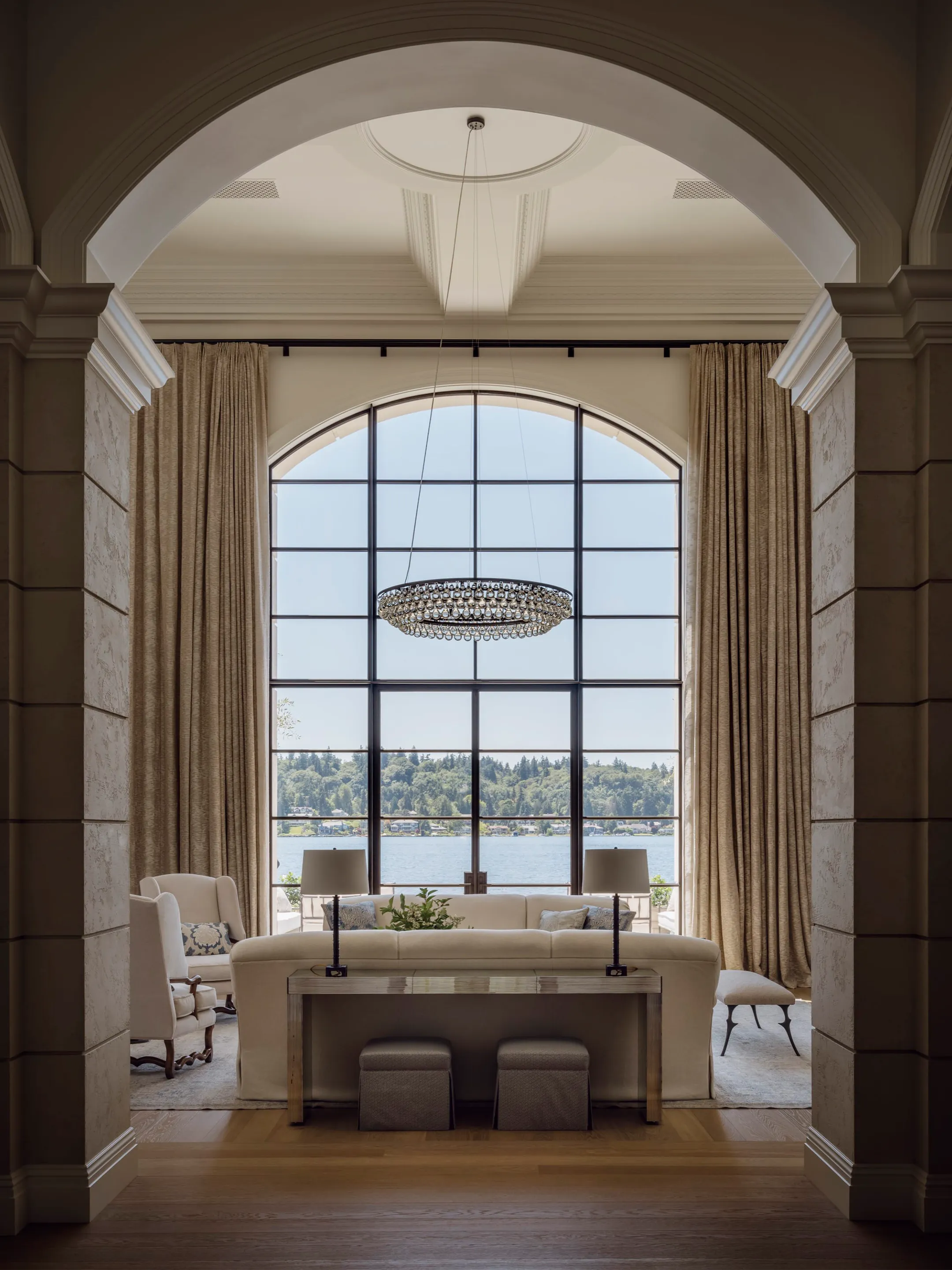
Communications for Ripple Design Studio, reflecting its collaborative approach to elegant, livable homes and presenting the studio’s projects, people, and philosophy with warmth and a sense of domestic life.
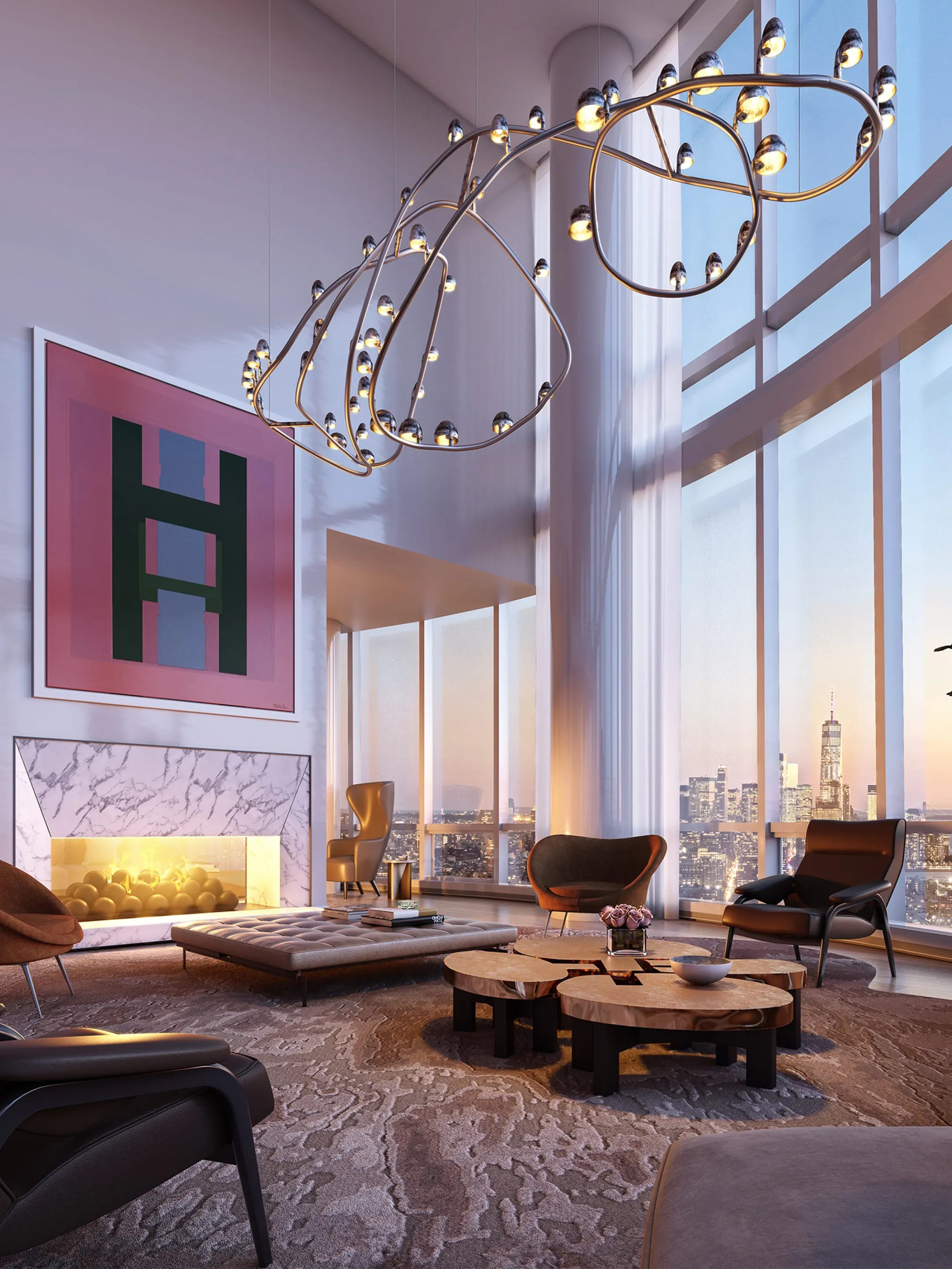
A website for Dufner Heighes, a New York architecture and interiors firm working across residential, hospitality, and retail projects. The practice has been described by the press as “minimalish.”
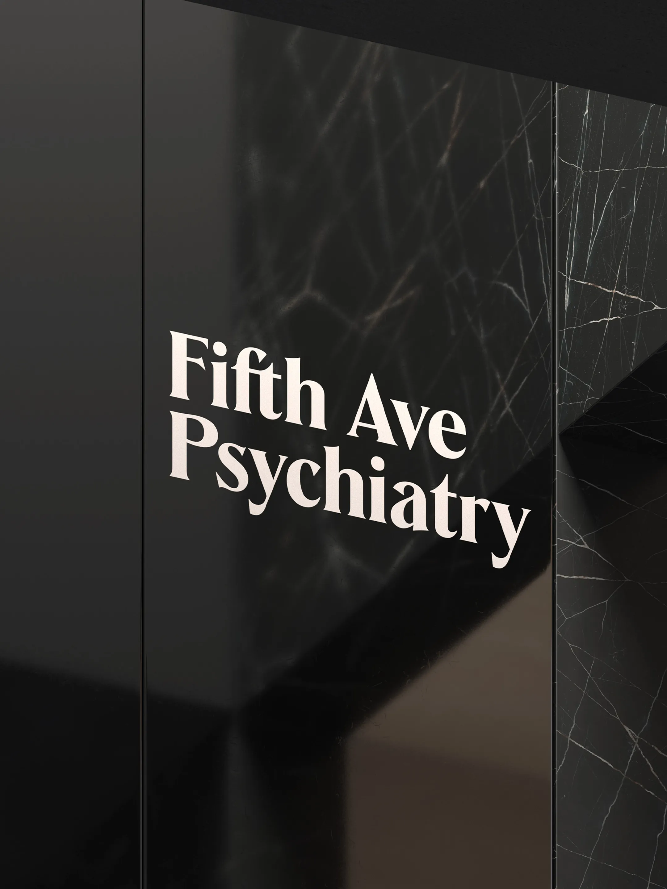
An identity for Fifth Ave Psychiatry, a private mental health practice. The system pairs an established character with the warmth of personal care.

Many thanks to our clients, partners, and friends for another exciting year. Here’s to 2026.
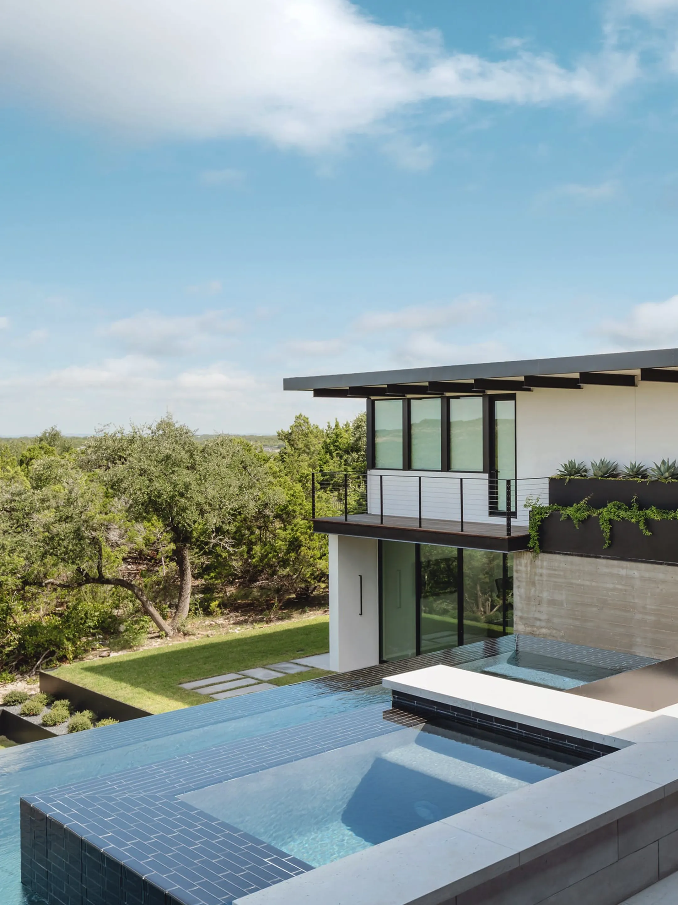
A website for Kopfer Taylor Interiors, founded by two University of Texas School of Architecture graduates who bring a five-step architectural process to interior design. The site carries that discipline forward with a restrained structure that gives each residence its own space.
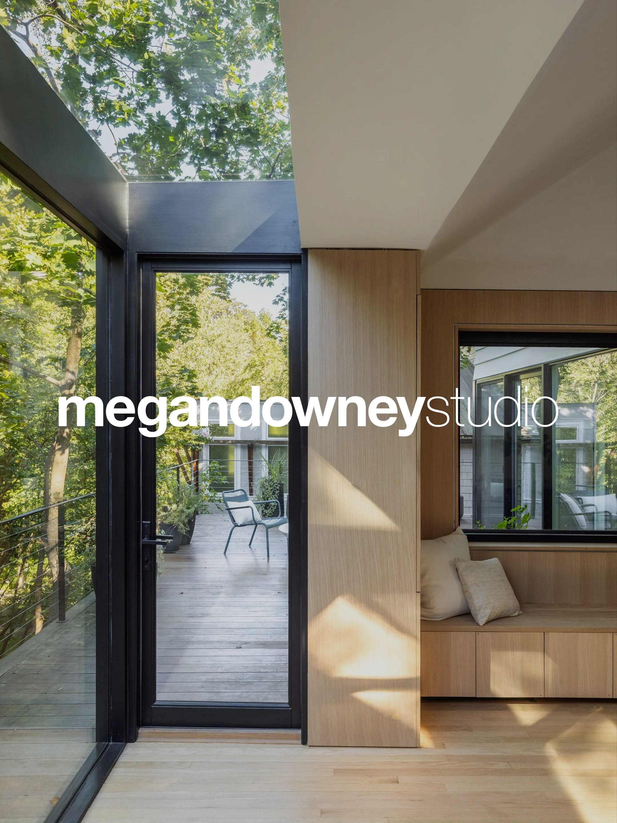
Positioning, identity, and communications for Megan Downey Studio, an architecture and interiors practice based in Washington, D.C.
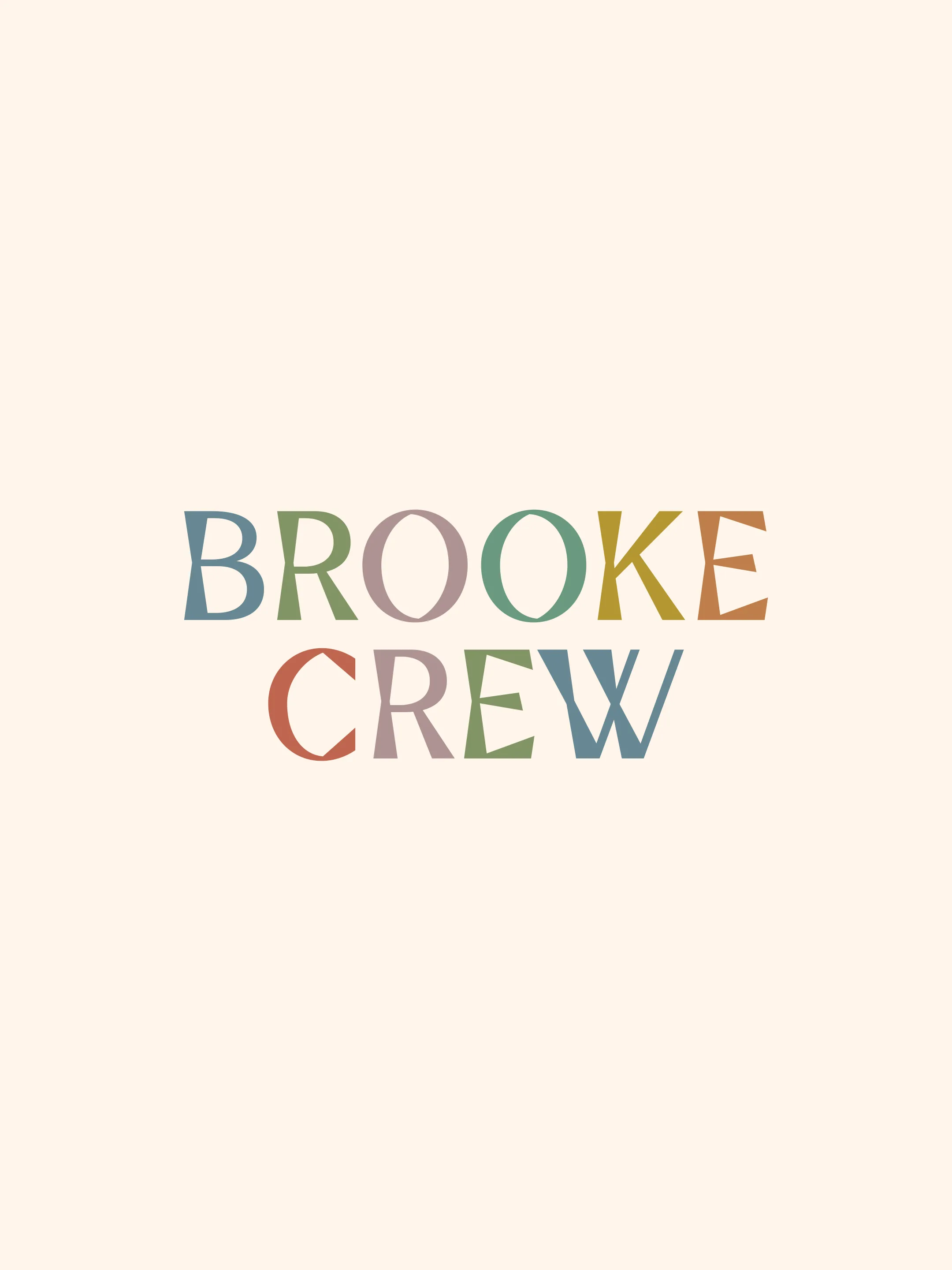
An identity for Brooke Crew Interiors, built around the studio’s distinctive use of color, pattern, and texture. Each letter of the wordmark draws from palettes found throughout the firm’s rooms.
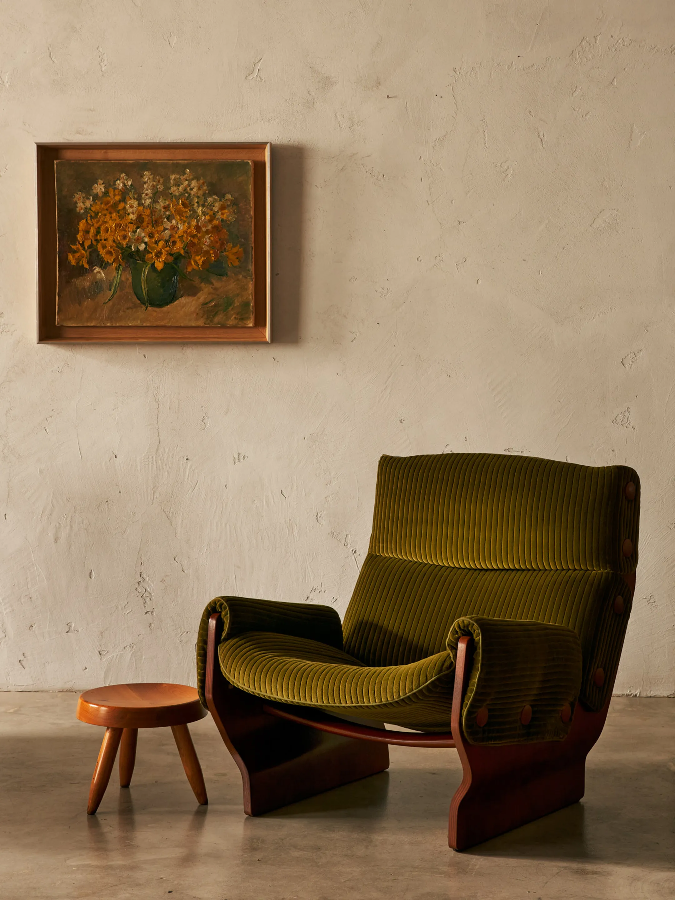
The debut website for Antiga Galeria, the Brooklyn gallery founded by Neal Beckstedt and Paulo Braga around vintage furniture and lived-in beauty.
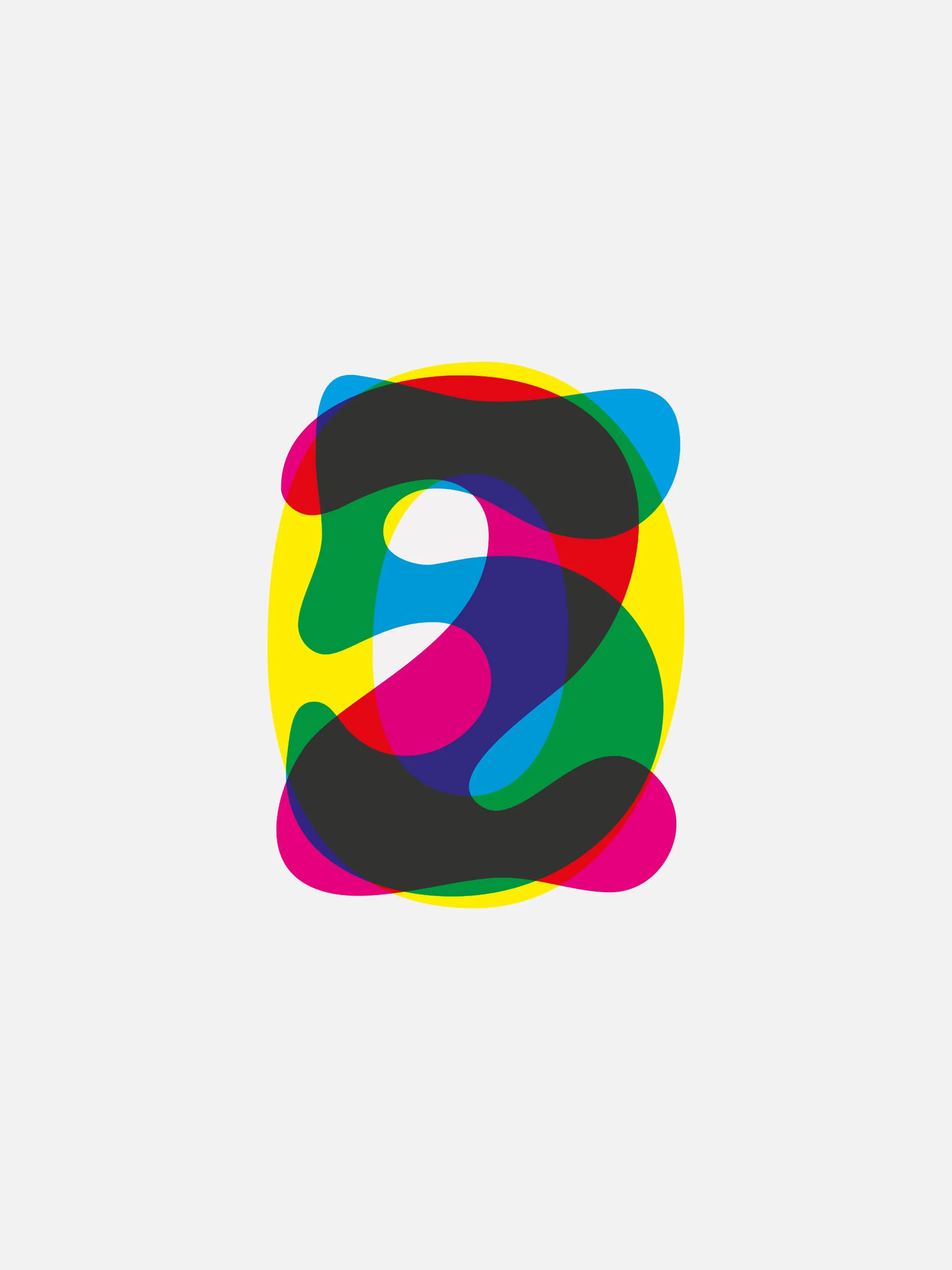
Thanks to our clients, partners, and friends for making our tenth year in business a success. Here’s to 2025.
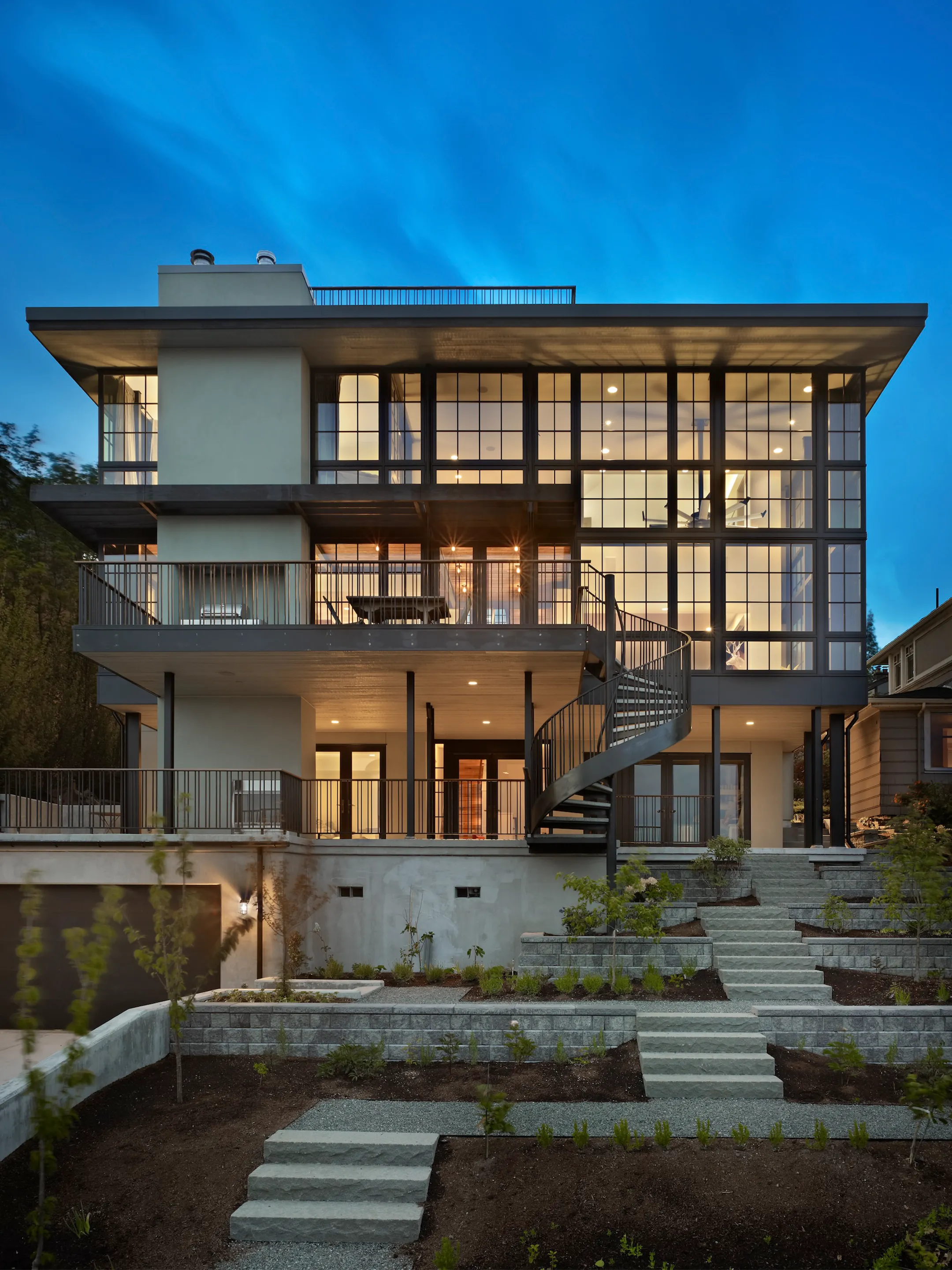
Positioning and communications for Janof Architecture, a Seattle practice designing urban, island, mountain, equestrian, and resort residences. The positioning centers on the practice’s response to the character of each place.
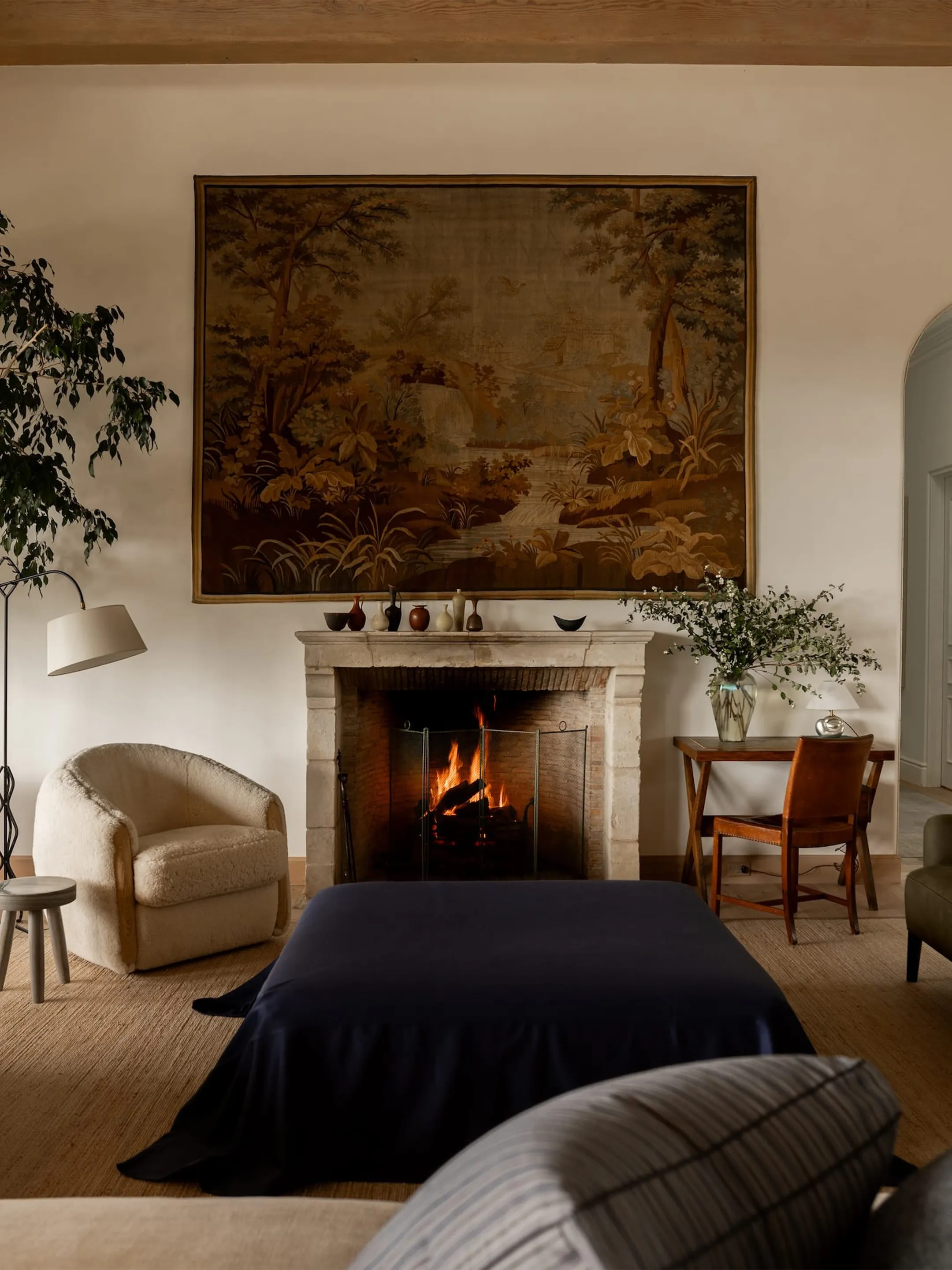
A website for Amy Meier, bringing the Rancho Santa Fe design studio and shop together across interiors, vintage finds, in-house collections, and artist collaborations, with a structure built to keep a growing inventory organized and discoverable.

A trade platform for Voutsa, built around the practical work of specifying and ordering wallpaper, fabric, and customizations. The system brings operational structure to rolls, yardage, trade registration, and bespoke requests that would otherwise depend on manual sales support.
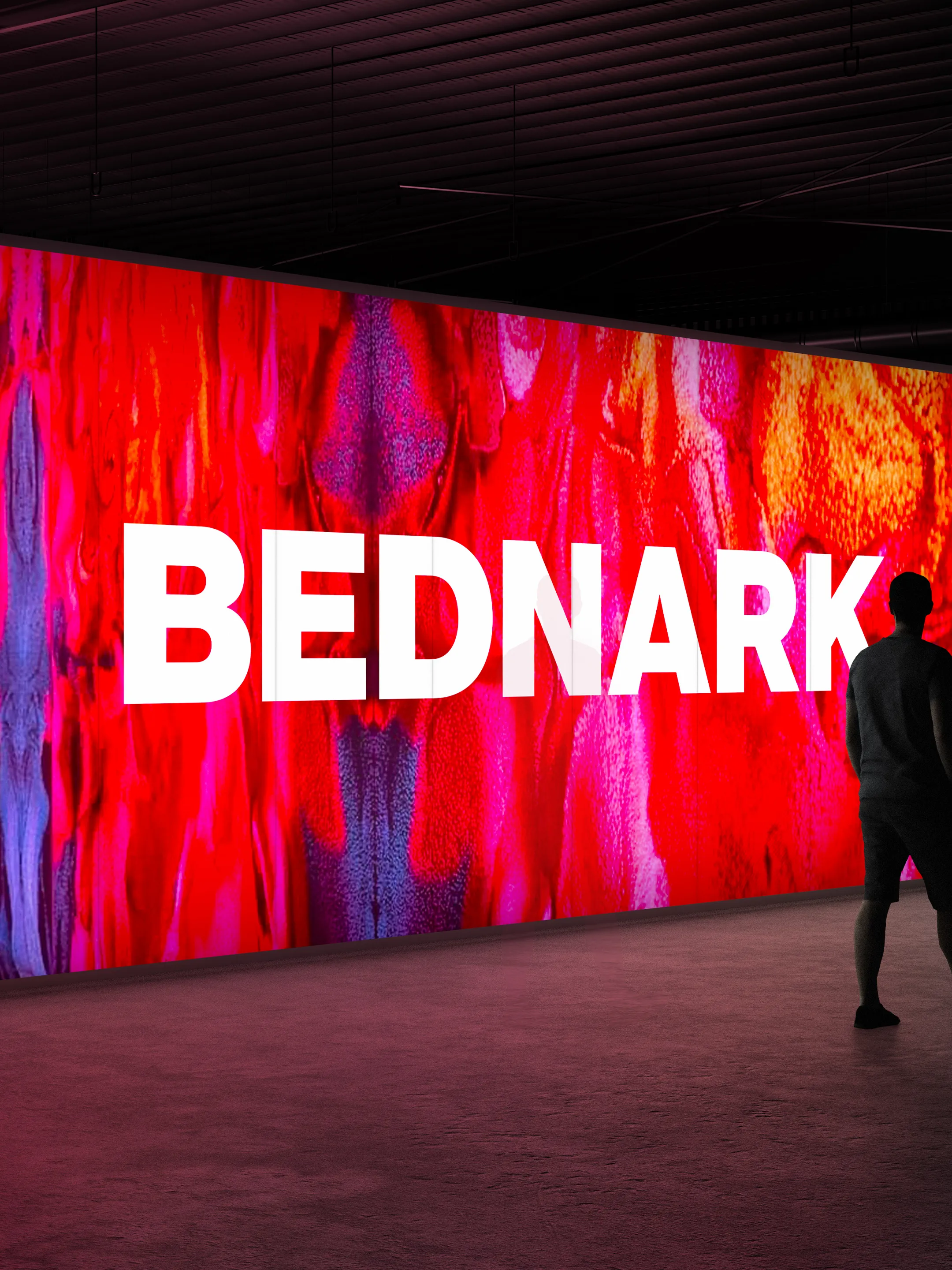
Strategy, identity, and communications for Bednark, the Brooklyn production studio behind retail environments and experiential activations for Nike, Airbnb, Tiffany & Co., Gucci, and Bvlgari. Centered on the proposition “Make it real,” the system extends across digital, print, merchandise, environmental graphics, and vehicles.
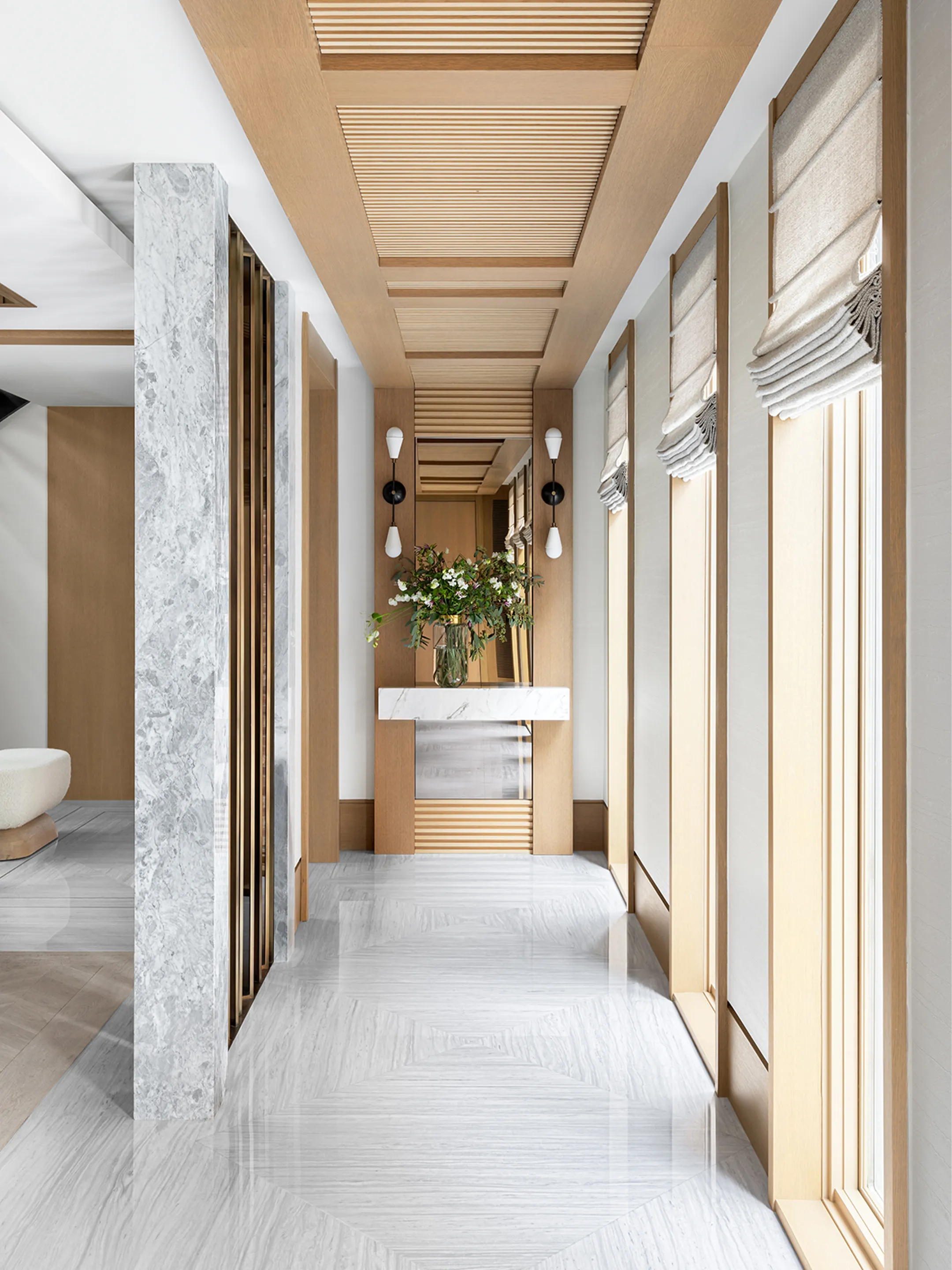
A website for Ovadia Design, bringing together the architecture and interior design practice’s residential, hospitality, and community work while preserving the distinct character of each project.

An identity for Nielsen Landscape Architects, pairing a hand-drawn botanical mark with a precise typographic system across print and digital.

Naming consultation, market positioning, and a website for SOL WAY, Diane Solway’s arts and culture consultancy. The consultancy draws on her career at CHANEL, W Magazine, and Surface, as well as conversations with artists including Yoko Ono, Frank Ocean, and Ai Weiwei.

As we approach our tenth anniversary, thank you to our clients, colleagues, and partners, some of whom have been with us since the beginning. Here’s to 2024 and the next ten years.
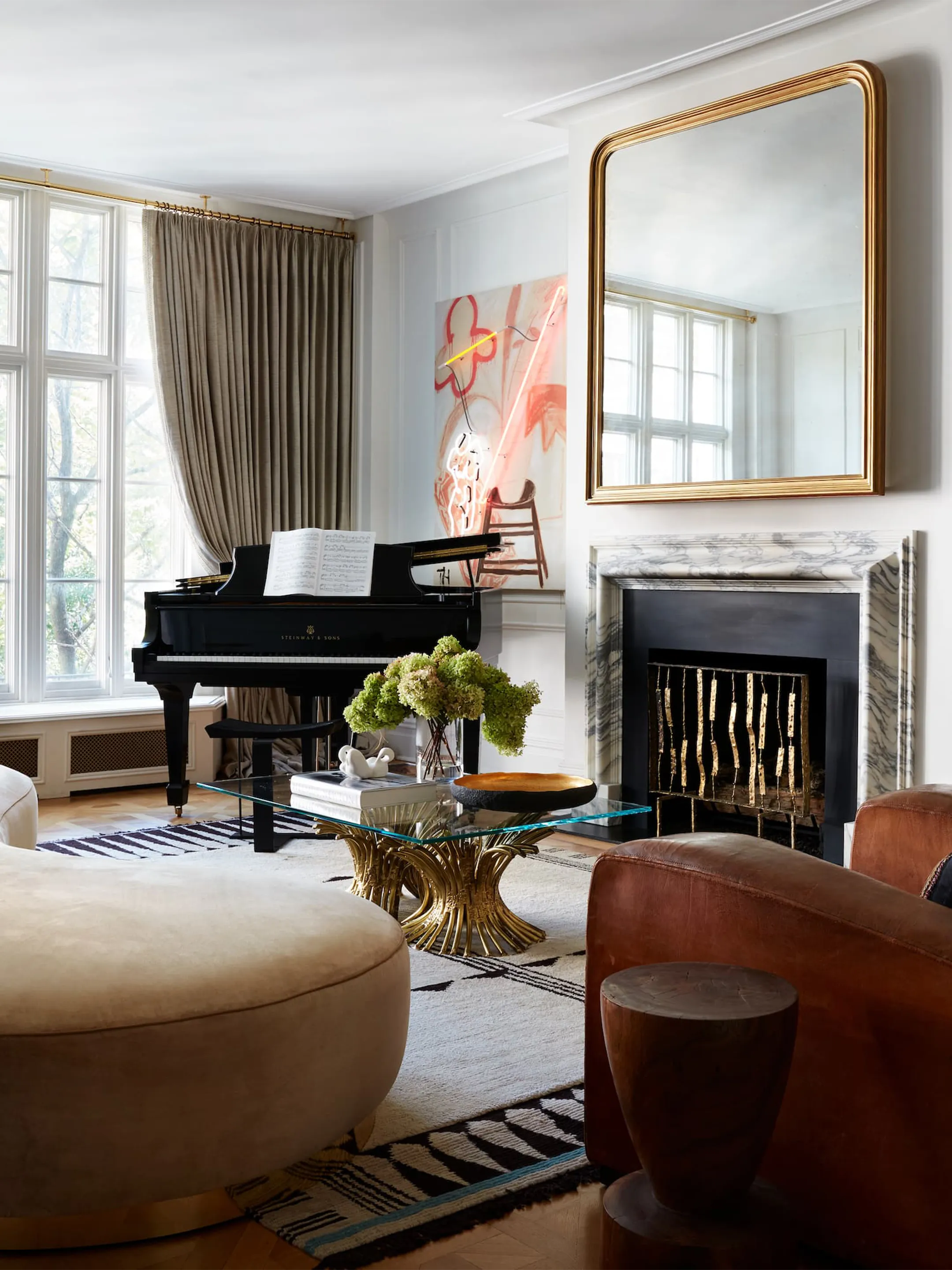
A website for Neal Beckstedt, the AD100 New York interiors firm, making its archive of residential work easier to navigate.
A website for Floyd Abrams: Speaking Freely, the PBS American Masters documentary tracing the First Amendment through the life and work of Floyd Abrams. The film premiered in 2023 and was nominated for an Emmy for Outstanding Politics and Government Documentary.
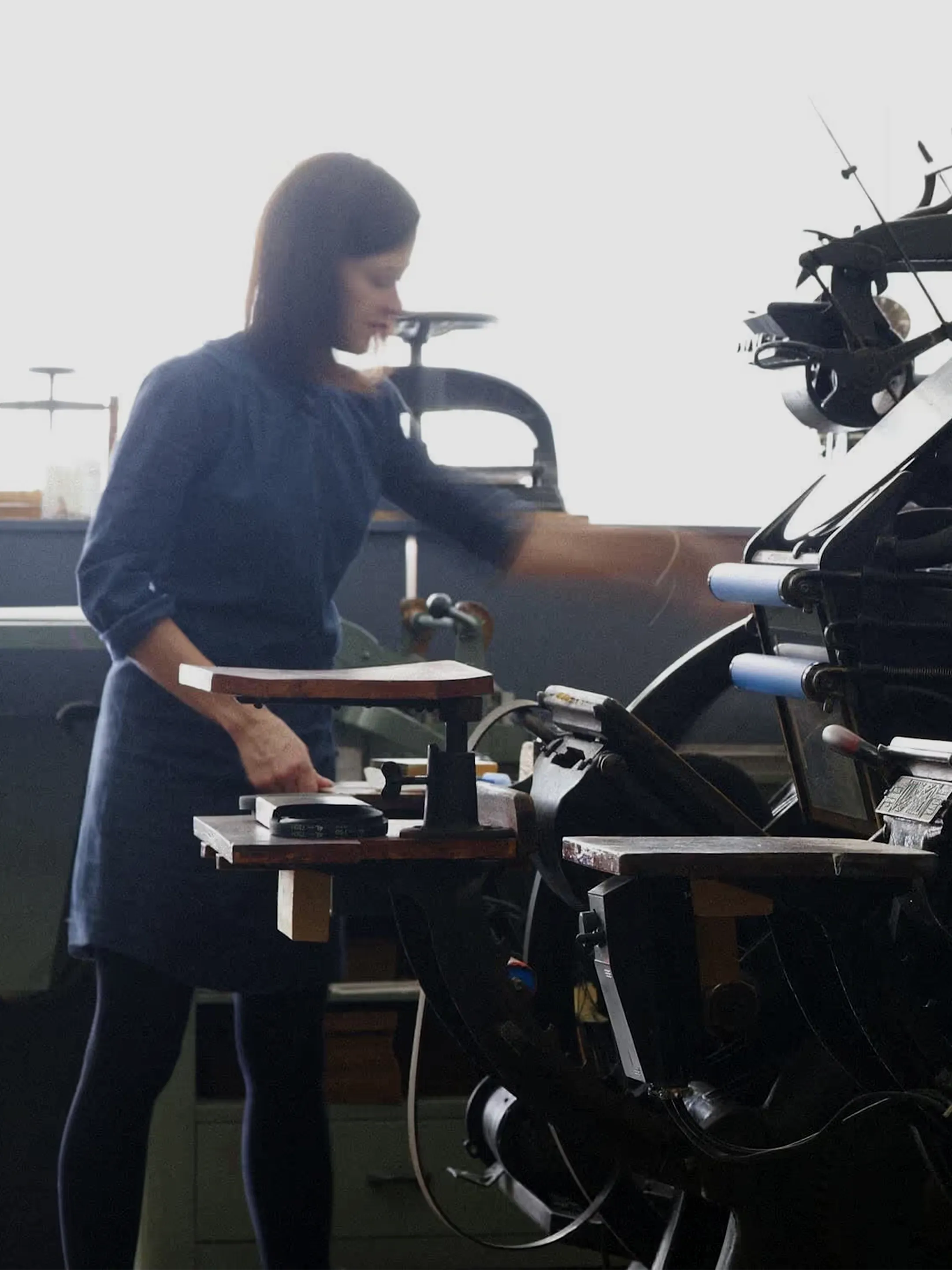
A digital storefront for Sesame Letterpress, the Brooklyn studio printing stationery by hand on antique Victorian presses. The site brings collections, customization, etiquette, and ordering into one system.
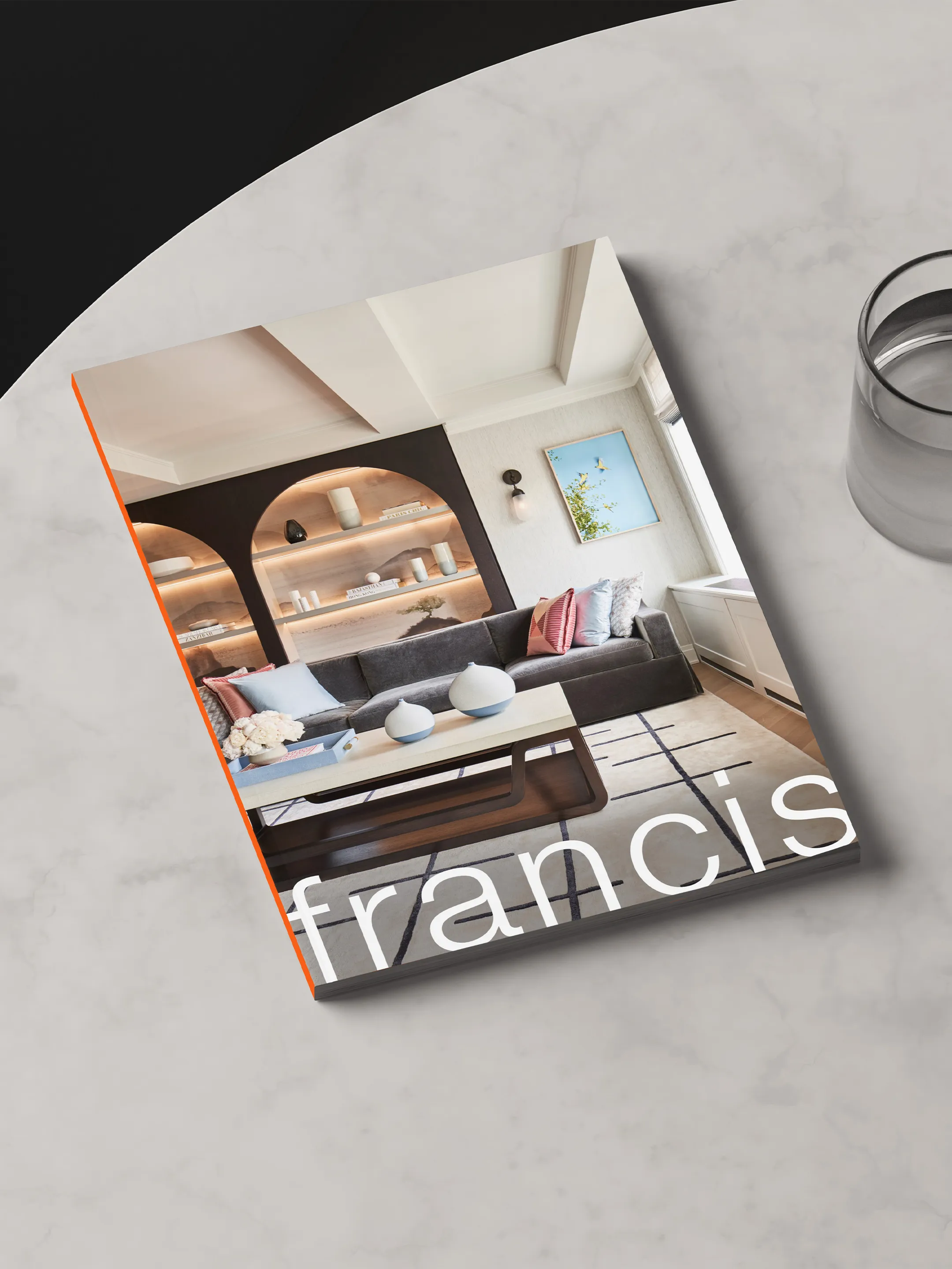
A printed portfolio for Francis Interiors, conceived less as a brochure than as a compact monograph. The book gives the firm’s residential work structure and permanence through sequence and proportion.

An identity for Better Health Advisors, a healthcare advisory firm. Four colored points around a neutral center turn the familiar cross into a picture of coordinated care.

An identity for Lauren Weiss Home, the San Francisco interiors studio, pairing a scalloped monogram with a spacious wordmark and muted palette.
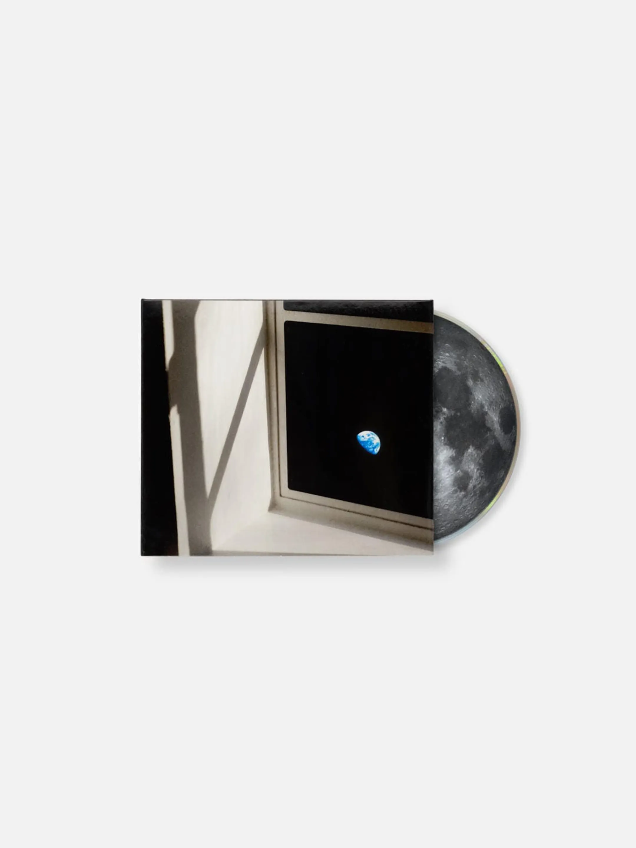
Cover art and packaging for Moon House—a literal expression of the album’s title.
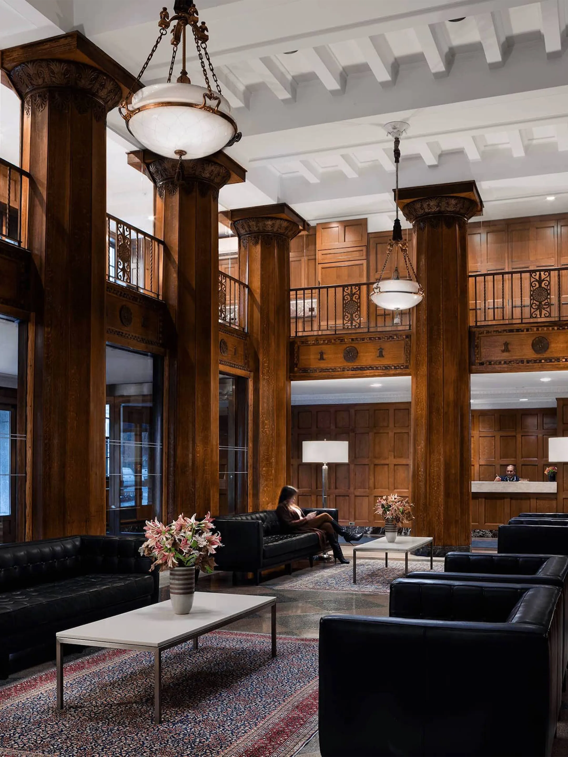
A website for Ethelind Coblin Architect, whose work spans the shared spaces of New York’s co-ops and condos. Organizing projects by building element makes the firm’s expertise in lobbies, hallways, façades, amenities, and elevators easier to place.

Positioning, identity, and communications for Harley Street Medical, a New York membership practice inspired by London’s medical district. The brand centers on access, discretion, and highly personal care.

Thank you to our clients, partners, and collaborators for another year. Here’s to 2023.
A website for Madigan Schuler, presenting residential and commercial interiors in an image-led system.
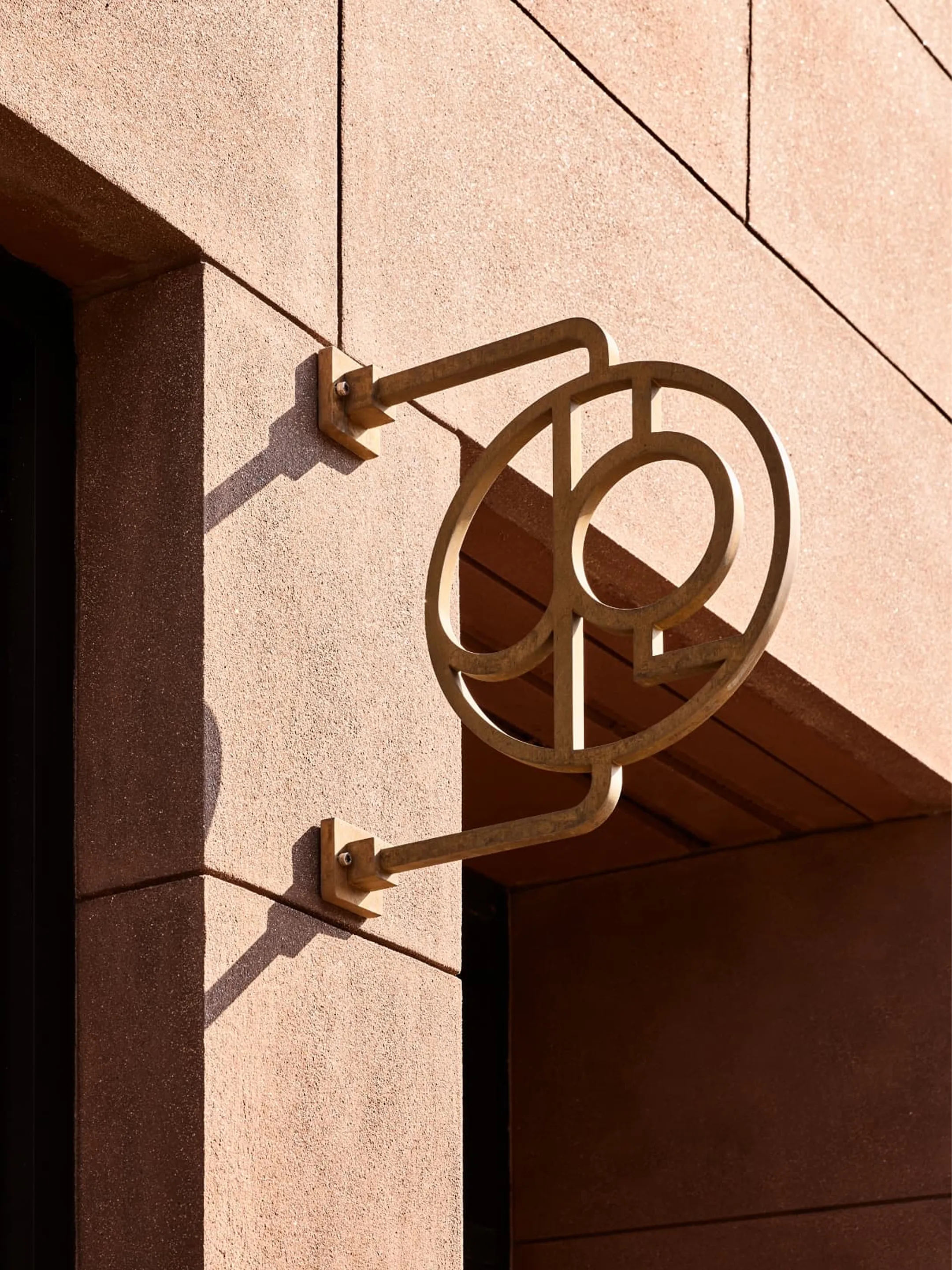
A website for Jesse Parris-Lamb, the Brooklyn interiors firm, giving equal weight to rooms, restored vintage finds, and bespoke pieces developed with independent makers. The work reflects close attention to scale, proportion, and the way bodies move through space.
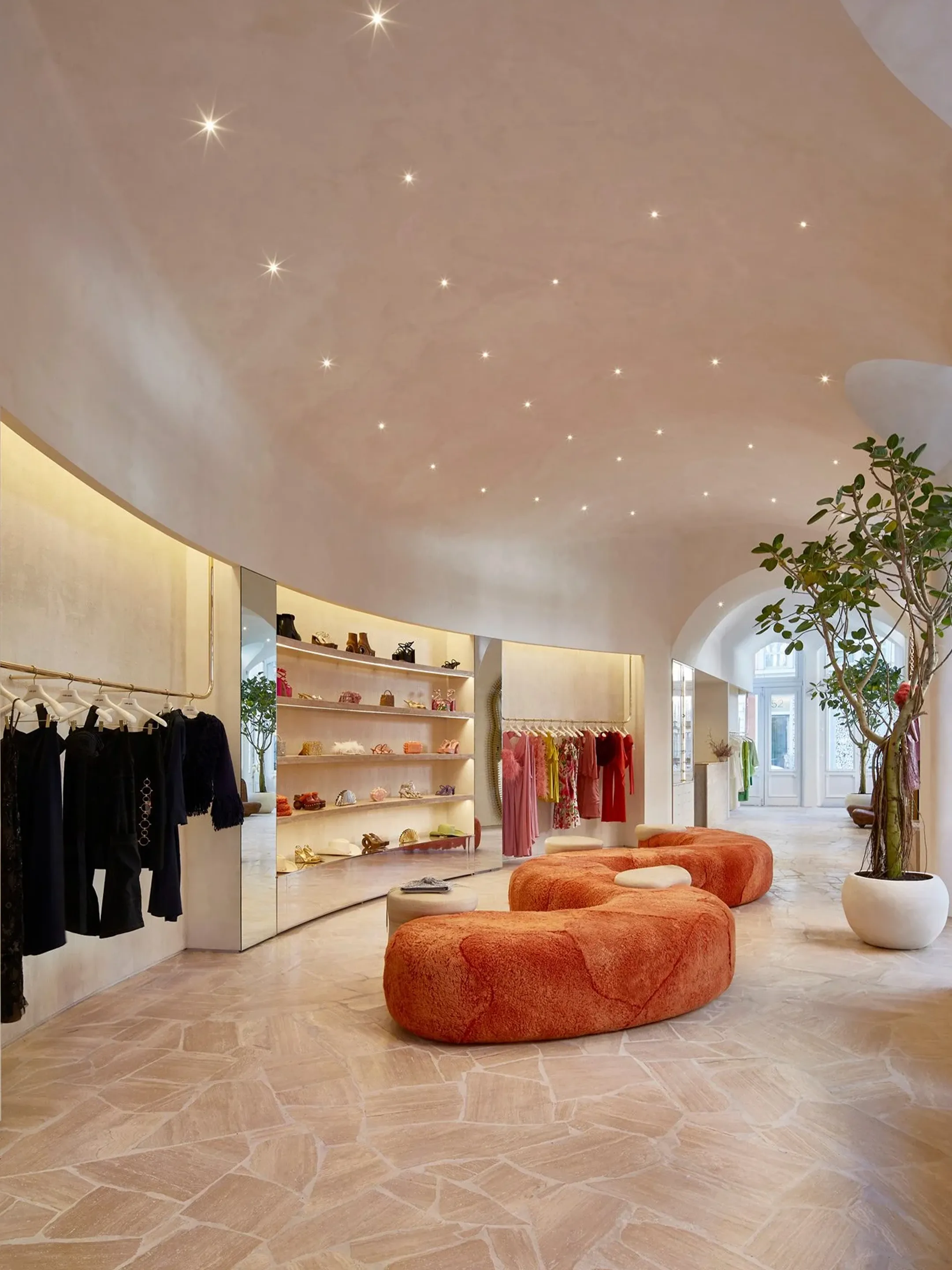
A website for Sugarhouse Architecture, organizing the practice’s residential, commercial, and landscape work.
Strategy, naming, and identity for a New York baker of vegan, gluten-free cookies. The name anticipates a second cookie.
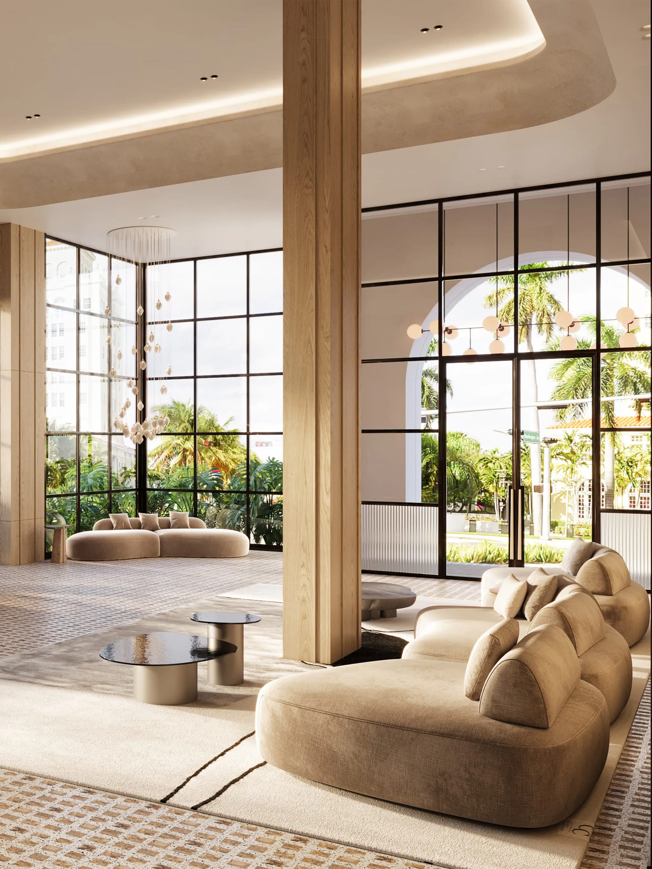
The debut website for Asprea Studio, Karen Asprea’s interiors practice, presenting its residential and commercial portfolio.
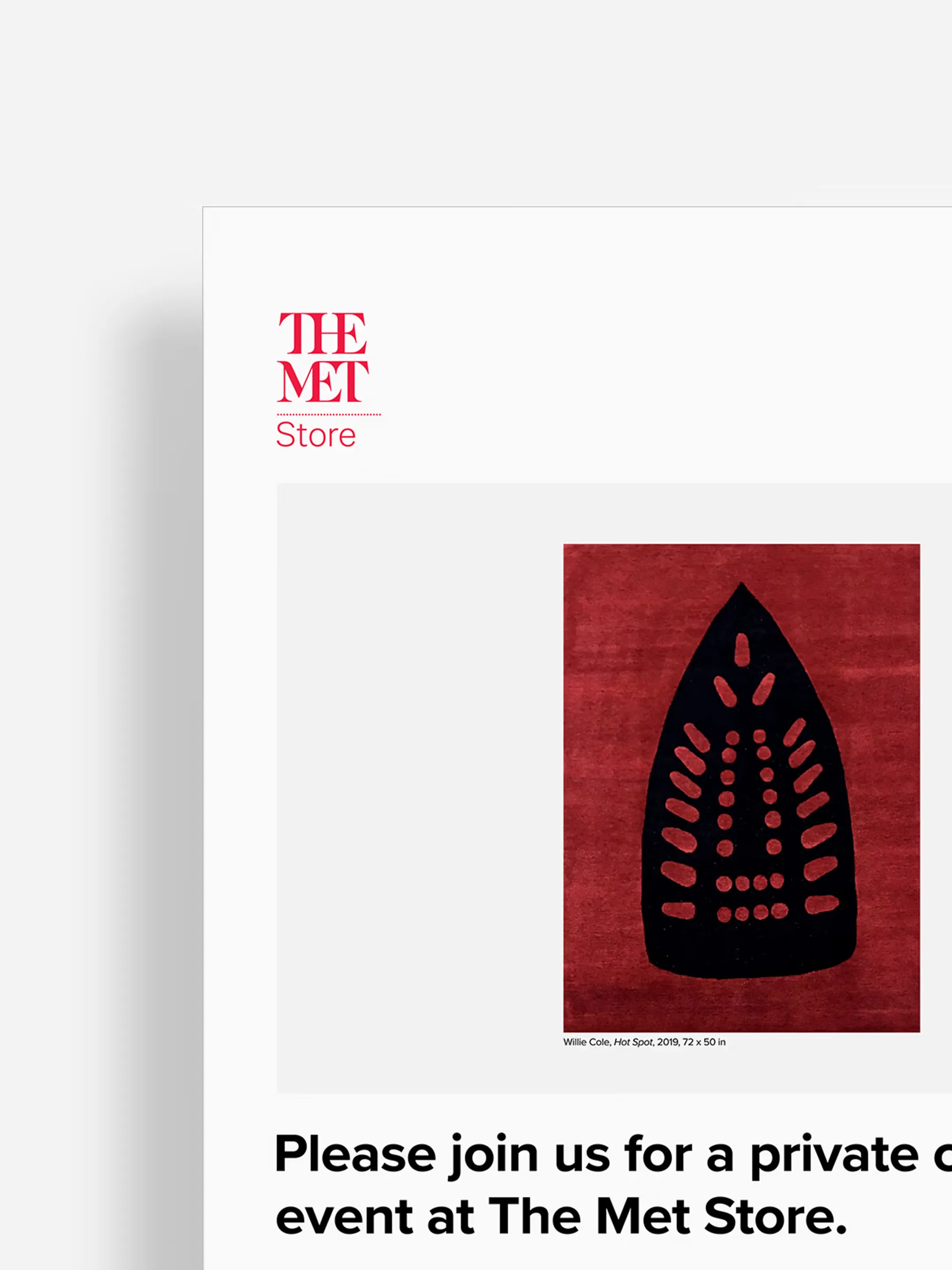
An invitation for The Met Store: modern art, cocktails, and a private evening at the museum.
Positioning and identity for Adequate Records, an independent record label. The work included the brand’s tagline: “Albums, not algorithms.”

An identity for Caitlin Kah Interiors, centered on a custom CKI monogram. Interlocking serif ligatures share a vertical stem, forming a mark that carries across print and digital.
Positioning, identity, and communications for The Willows, a European-style mansion set within a 49-acre public preserve in Villanova. The brand draws from the estate’s architecture, landscape, and romance to give the venue a distinctive presence for weddings and celebrations.

Thank you to our clients, partners, and collaborators for another complicated and rewarding year. Here’s to 2022.

Positioning, identity, and communications for Thaxa, an executive coaching firm applying performance science to consequential decisions.
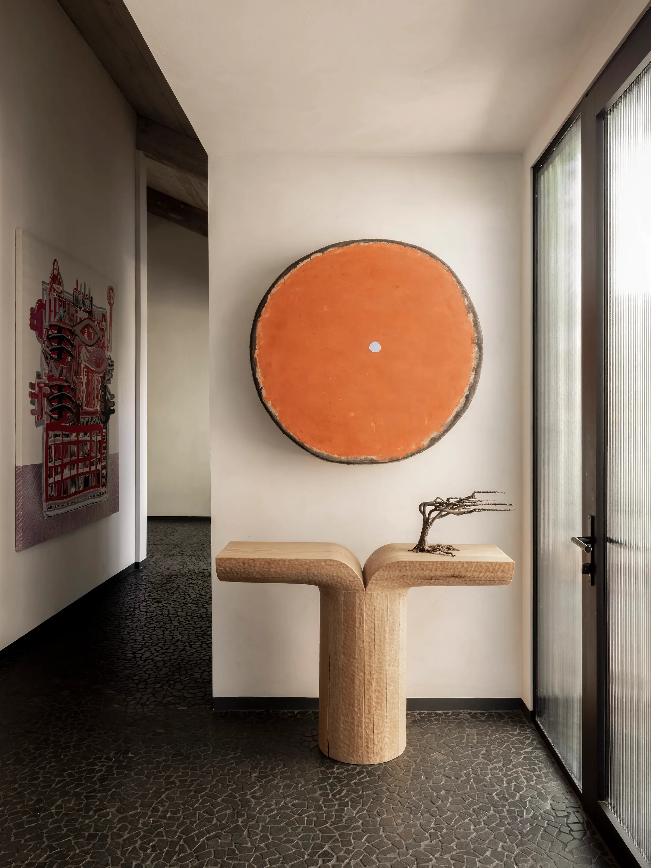
A website for the three-time AD100 designer, giving his layered interiors room to stand on their own.
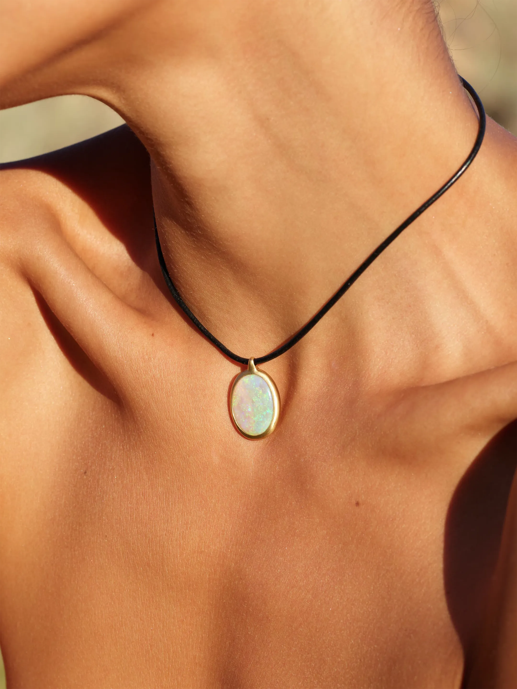
The debut website for MG Stones, the fine jewelry brand founded by two former Vogue editors.
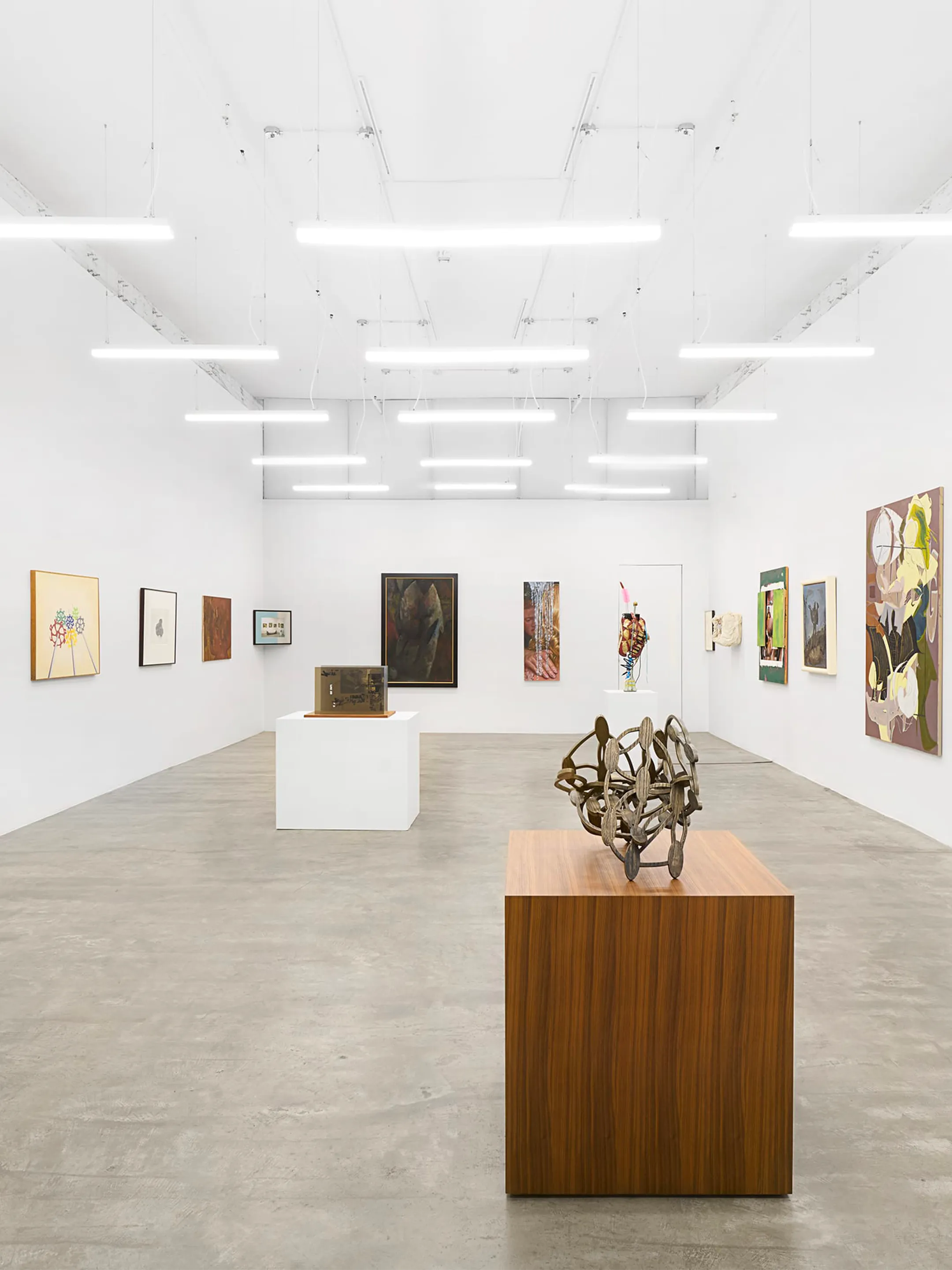
A digital archive for David Lewis Gallery, organizing artists, exhibitions, fairs, and publications.

A website for Kramer + Kramer, the New York agency representing photographers, stylists, makeup artists, and set designers. Each piece of fashion work links back to the artist who made it.
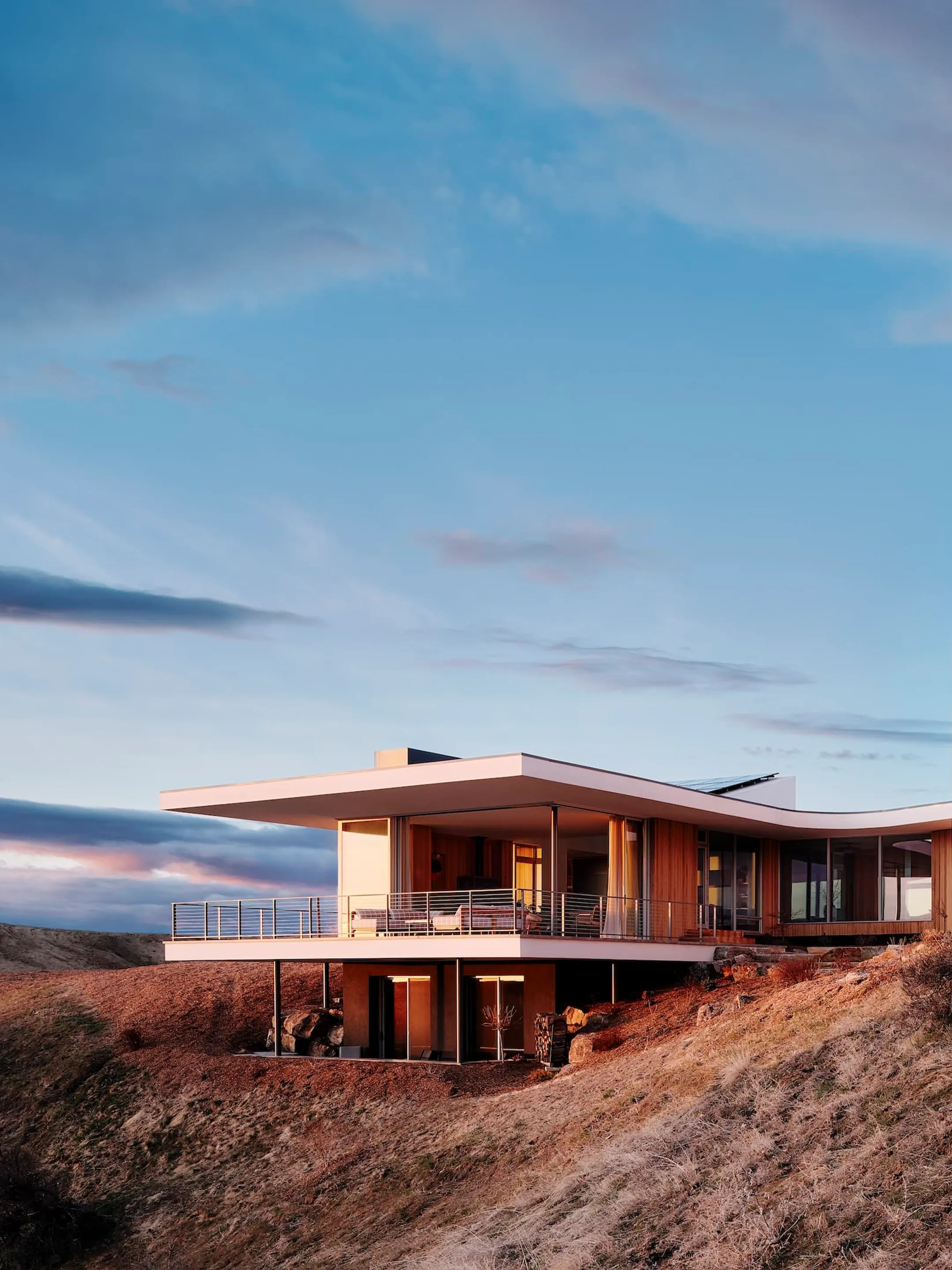
A website for Pappas Miron, the ELLE Decor A-List interior design firm, bringing together its projects in New York and beyond.

An identity for Third, a wealth management firm, centered on discretion, discipline, and long-term judgment.
Identity and communications for Washington Square Park Dental, positioning design as a reason to choose the San Francisco practice. Its LEED-certified space was named by Inc. among the world’s coolest offices.
2020 was a difficult year, made meaningful by our clients, partners, and collaborators. Here’s to a healthy and peaceful 2021.

An identity for an interior designer who starts with textiles. Three separate strokes sit together like threads on a loom.
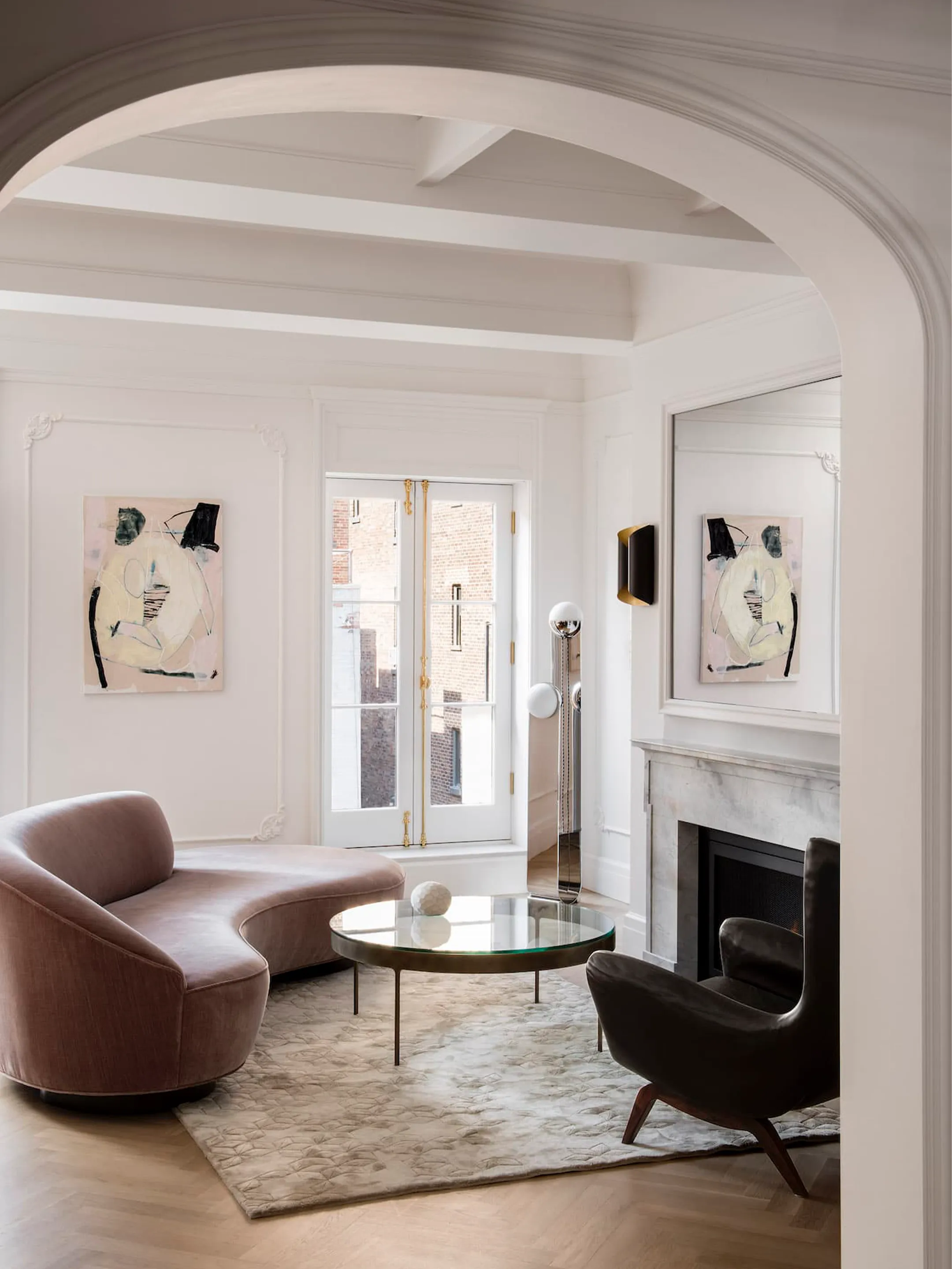
A website for Gramercy Design, bringing together the New York interiors practice’s residential work across the country.
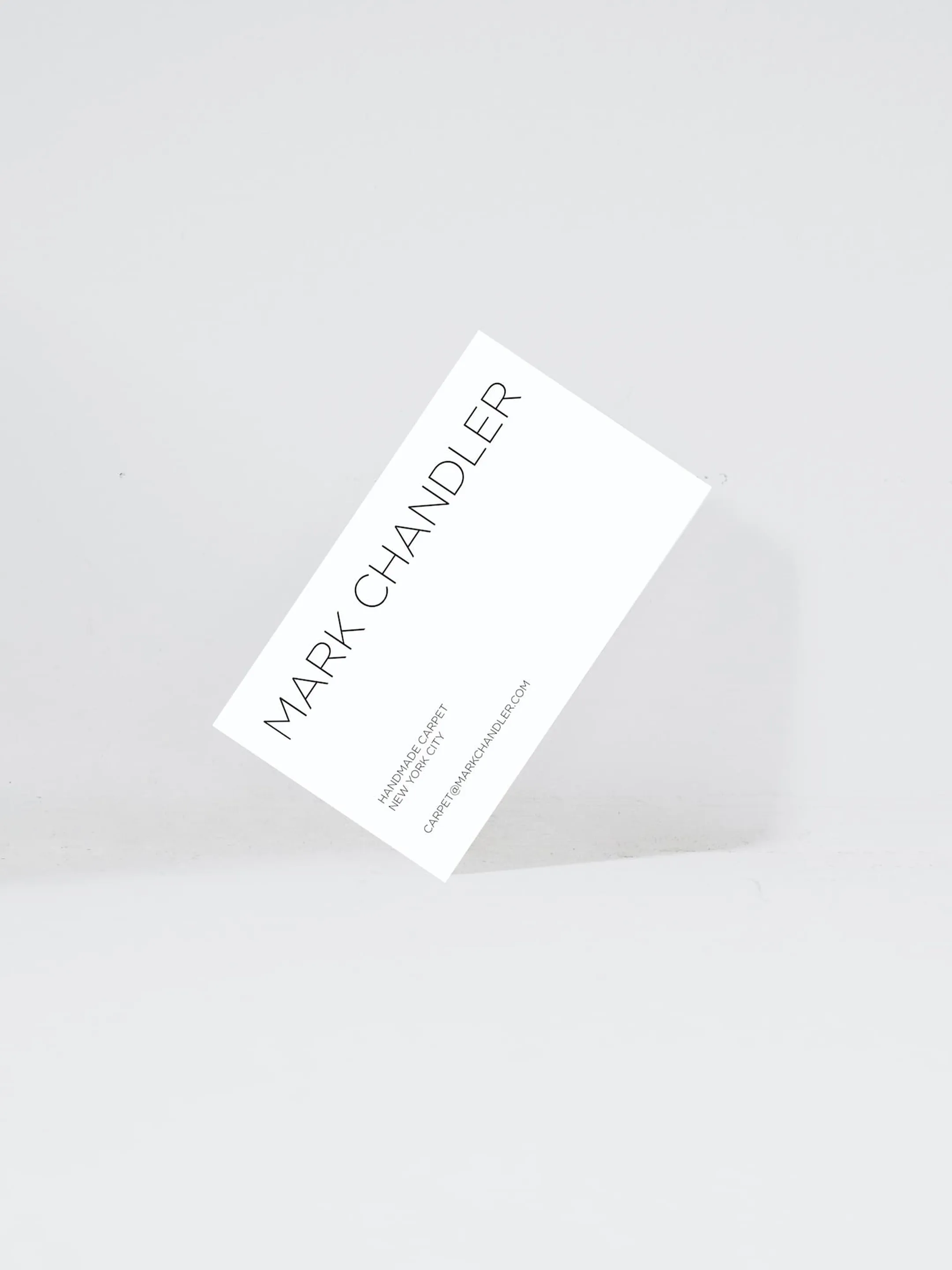
An identity attentive to the material irregularities and handwork that define Chandler’s carpets.
A company-wide repositioning and identity for Peachtree, the Philadelphia-area catering and events company, extending across its family of venues and a new concept. Developed with its leadership, the partnership continued through the pandemic with strategic consultation and creative initiatives.

More than forty years of interior design distilled into a simple, architectural mark.
Thank you to our clients, partners, and collaborators for making 2019 our best year yet. Here’s to 2020.

A website for the New York law firm, boutique in scale and broad in commercial practice.
An identity for Thea Valentina, a womenswear line bringing handcrafted Moroccan caftans into modern silhouettes through a partnership with women-owned artisanal cooperatives.
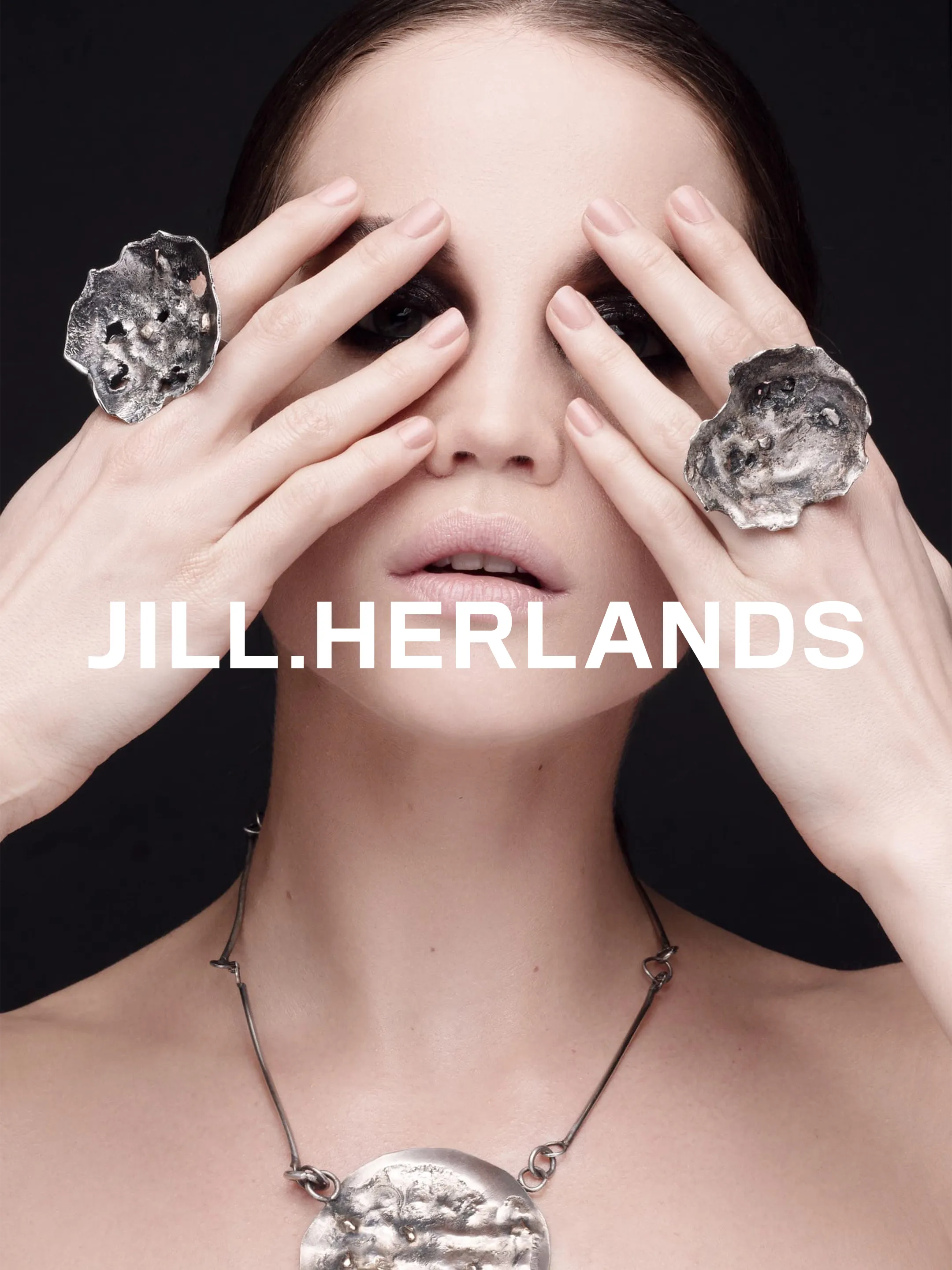
An identity for the contemporary metalsmith whose pieces pair precious metals with concrete, meteorite, pottery shards, and raw crystals. A bold wordmark, blind-embossed packaging, and fashion-led photography take their cue from the work.
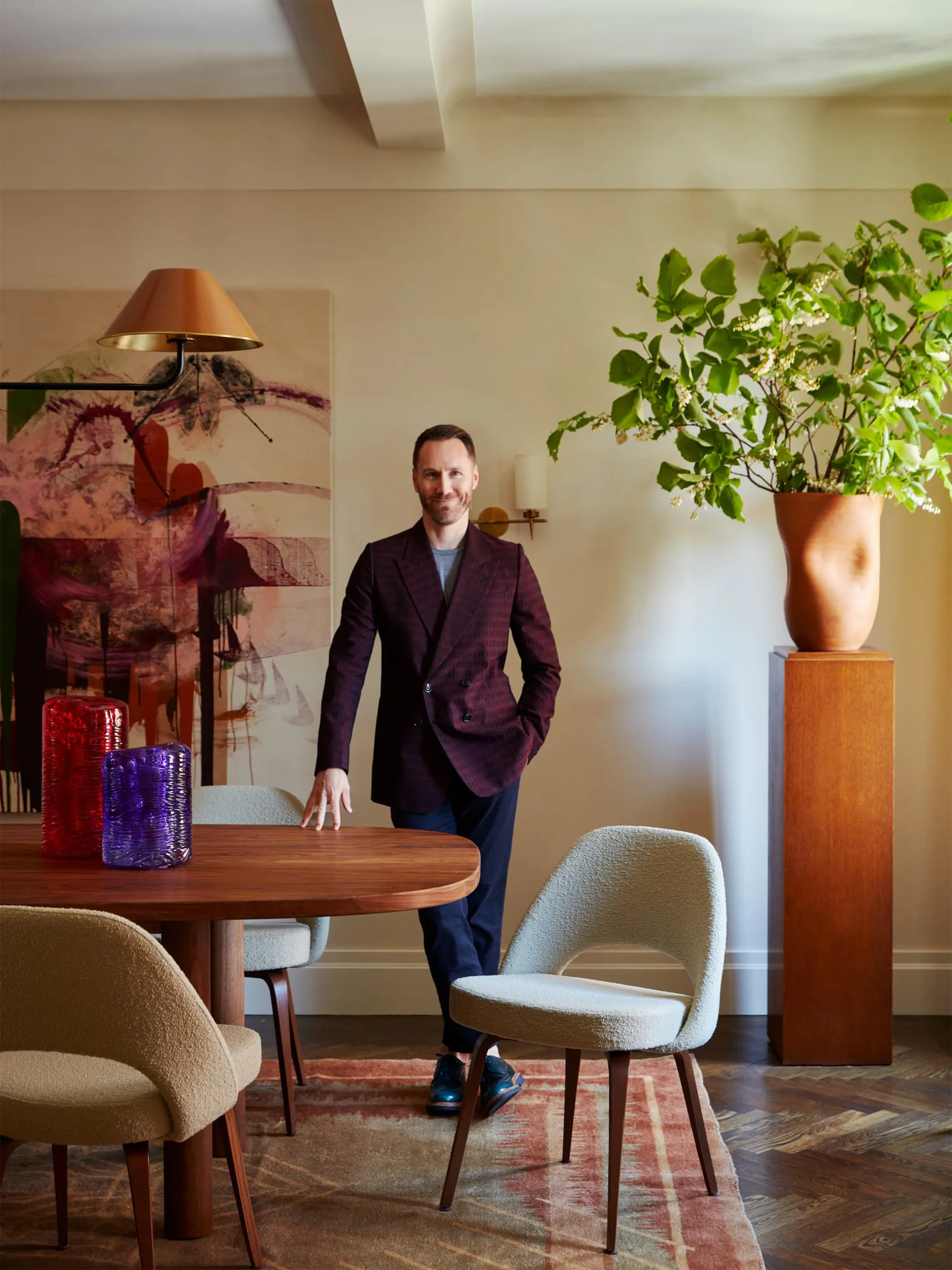
A debut website for Josh Greene Design, the New York interiors studio, reflecting its balance of functionality, warmth, and comfort.

Thank you to our clients, collaborators, and friends for 2018. Here’s to 2019.
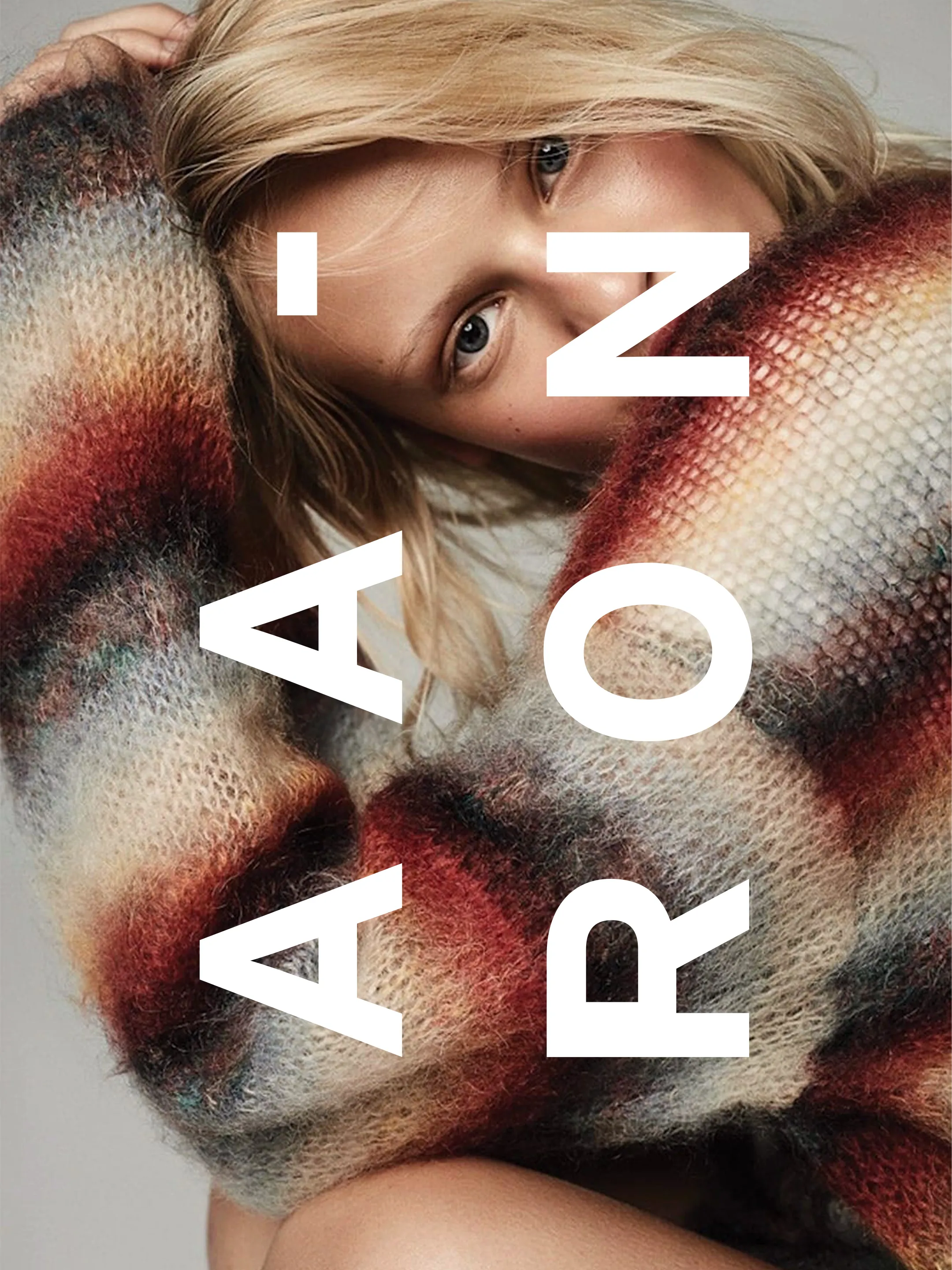
Promotional postcards for the Los Angeles fashion photographer.
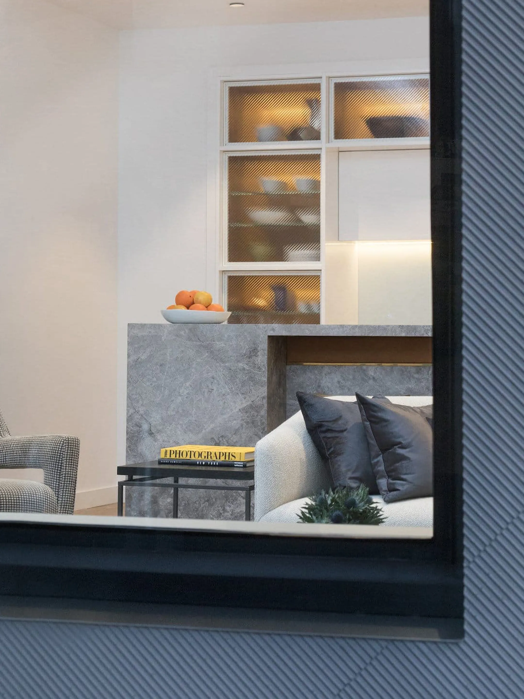
A website organizing Cape Advisors’ residential, commercial, retail, and hospitality portfolio, from the Mondrian Hotel and 100 Eleventh Avenue in Manhattan to Watchcase and Baron’s Cove in Sag Harbor.
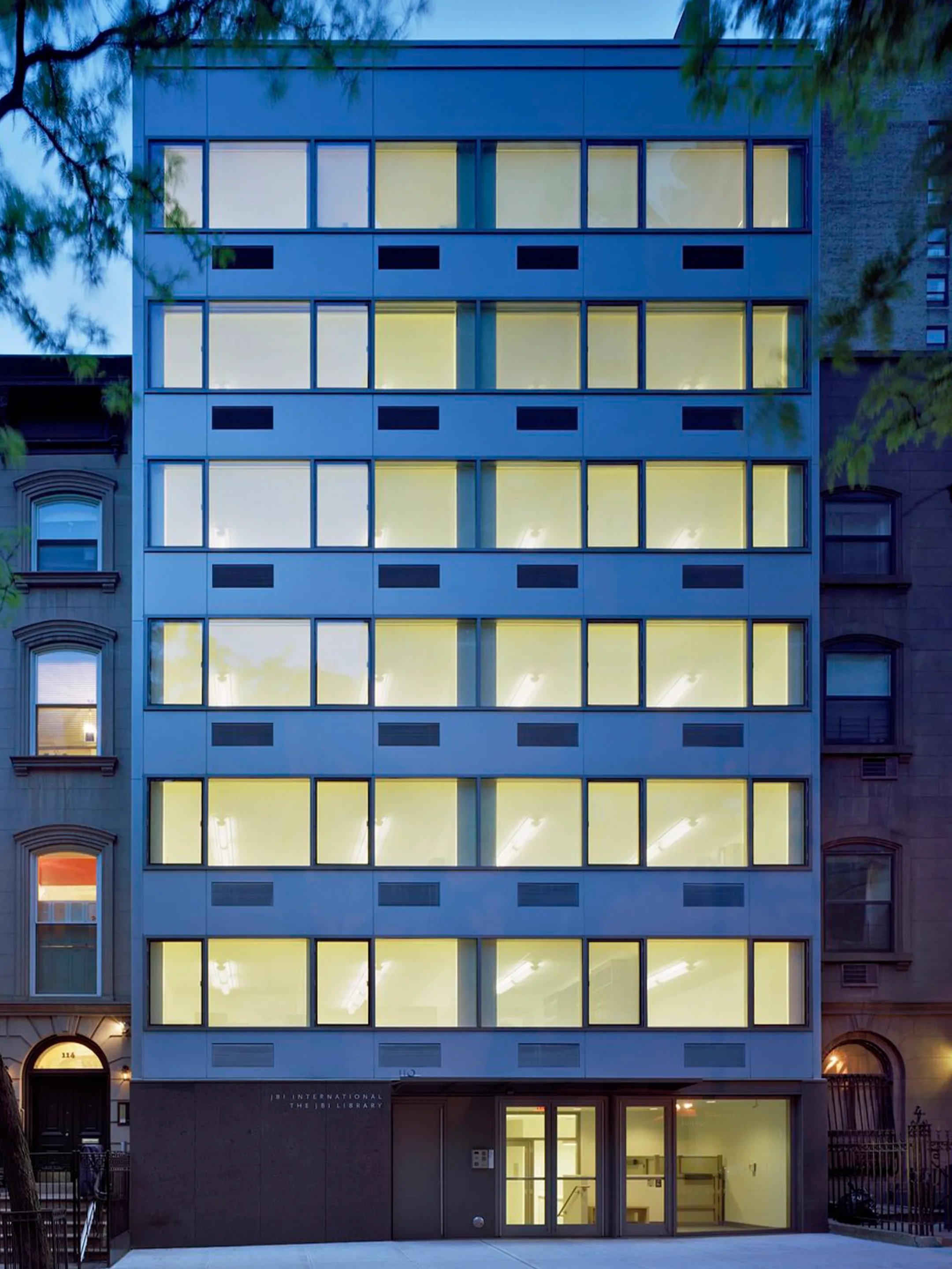
Identity and communications for Fink & Platt Architects, refined over time for a practice devoted to restoring, expanding, and furnishing historic spaces.
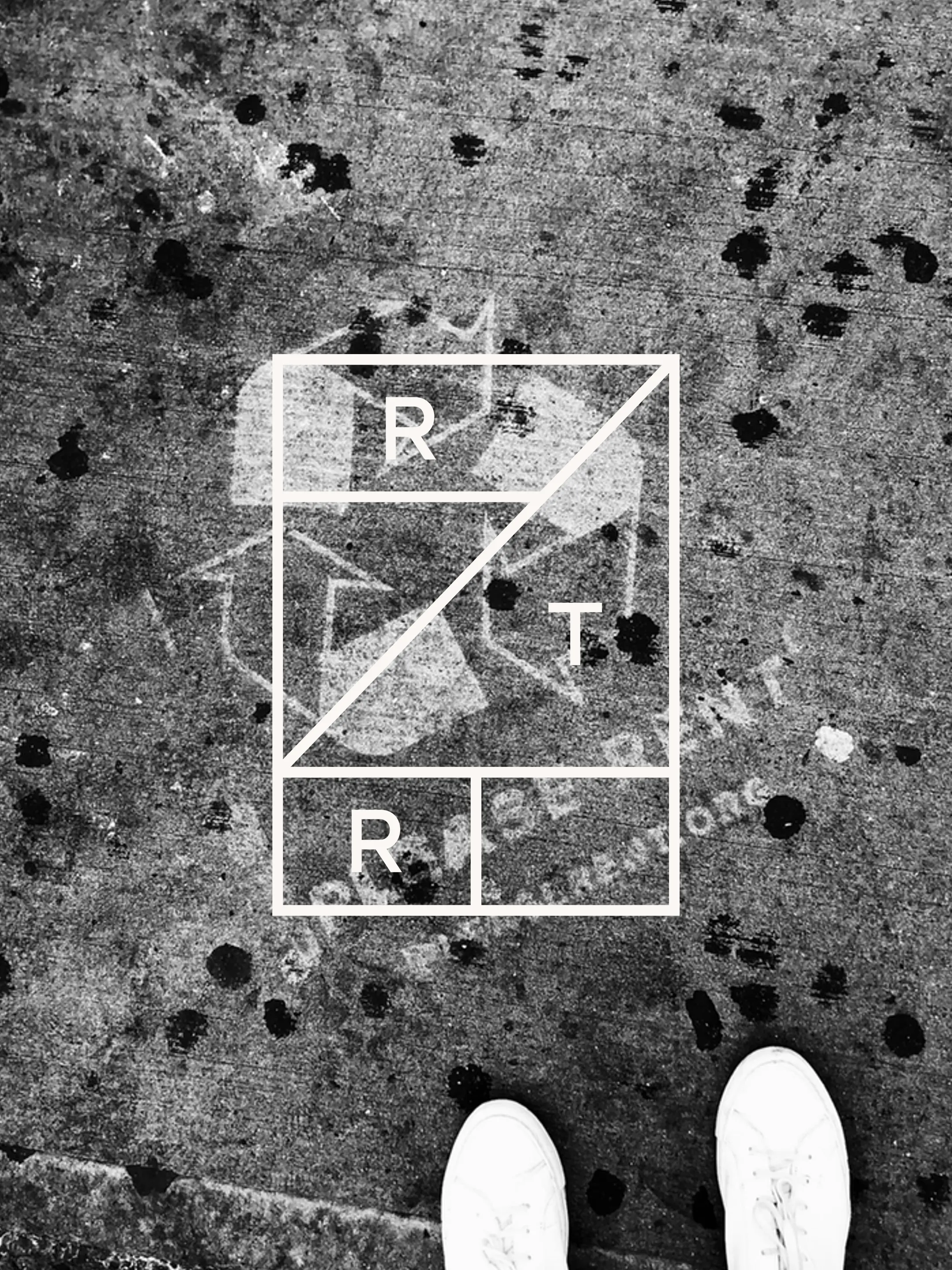
For Earth Day, an interactive diagnostic for Rent the Runway calculated the hidden impact of everyday garments. Sidewalk stencils carried the campaign to the doors of fast-fashion retailers.
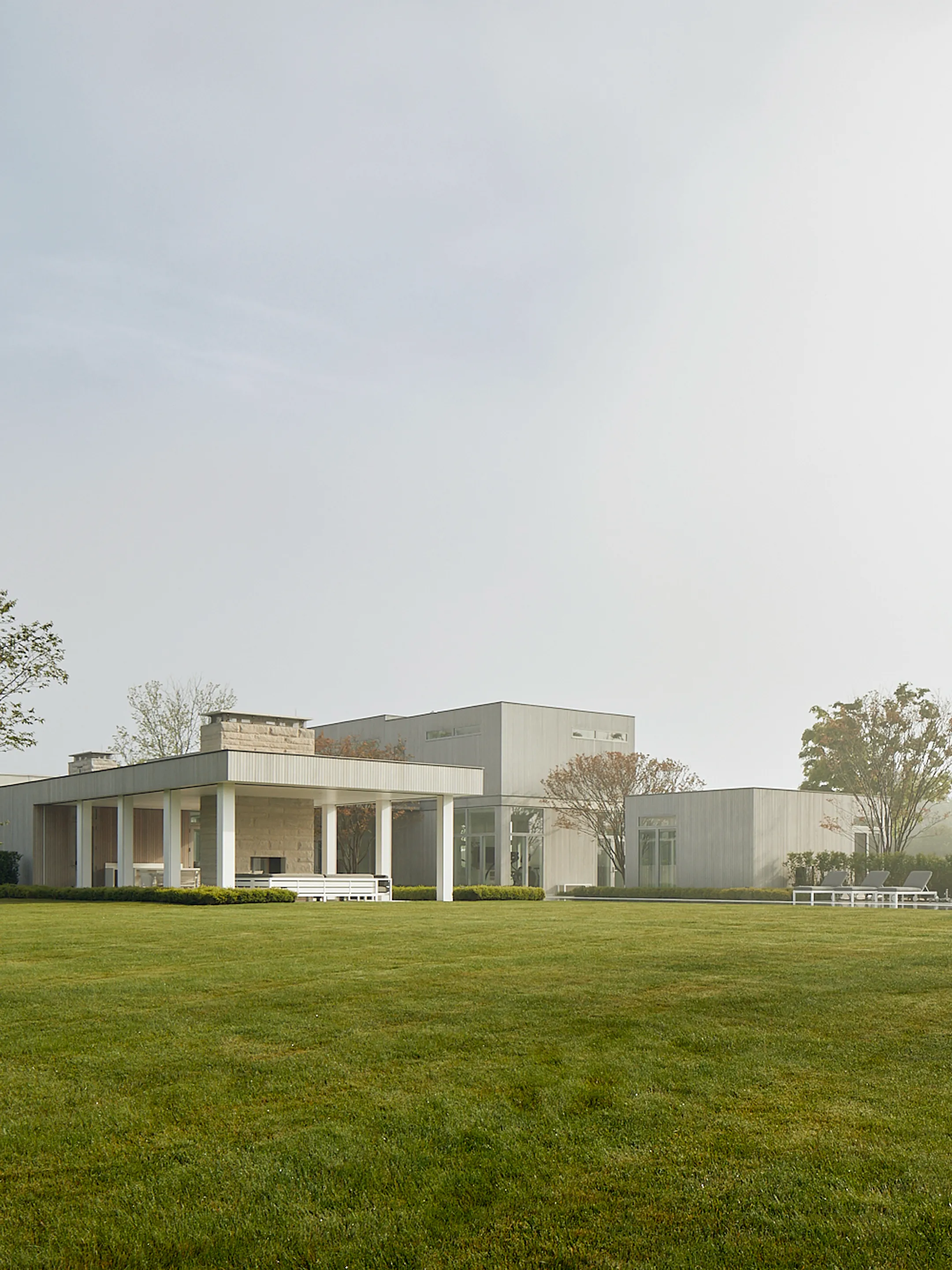
Identity and communications for Temple Simpson Studio, a New York architecture practice. A minimal, monospaced typographic system reflects its emphasis on rigor and craft.
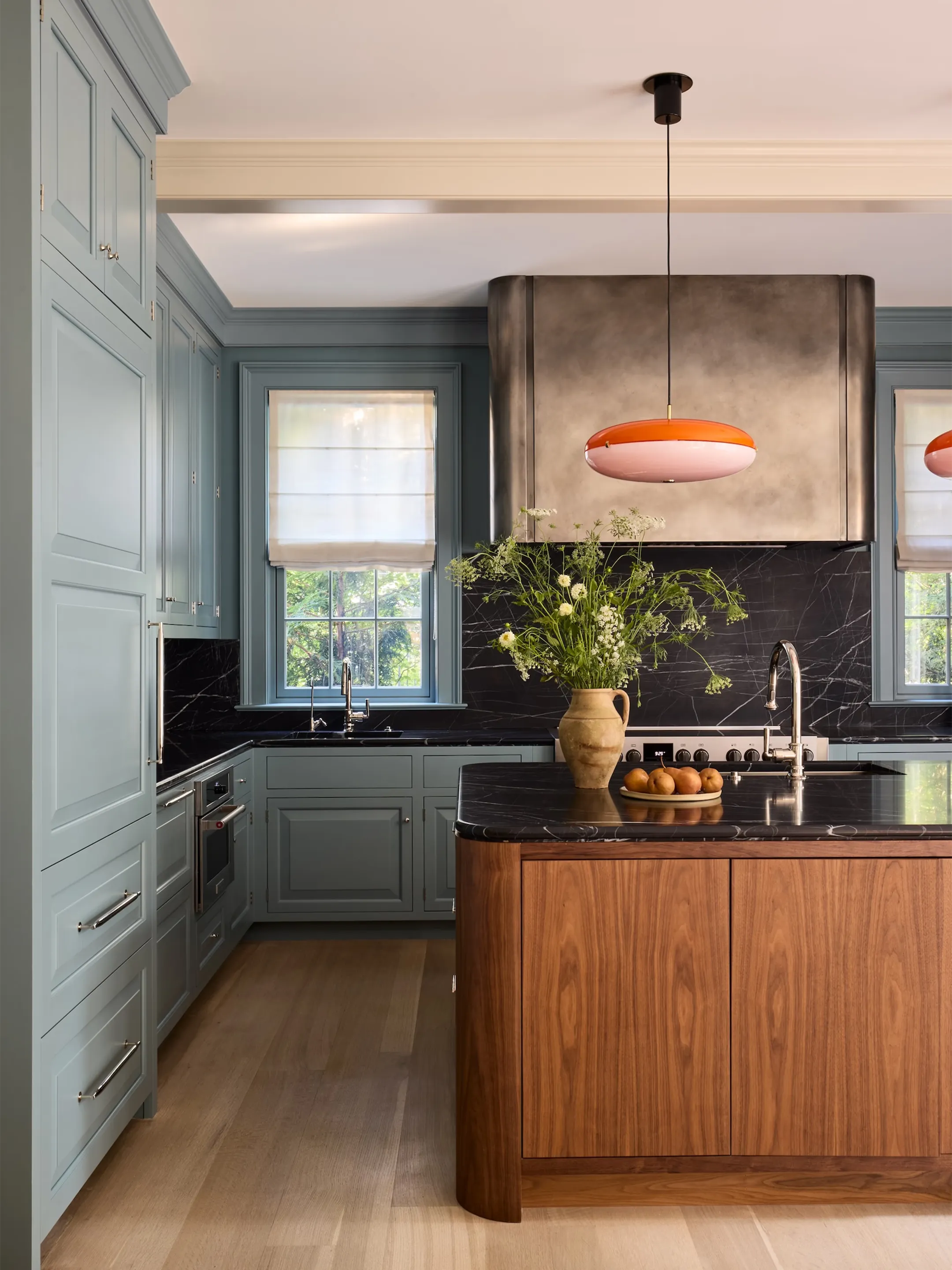
A website for Zoë Feldman Design, framing traditional architecture, art, color, and collected detail within a contemporary system.

An identity for Small Bands of Misbehavior, a production studio whose clients include American Express, Google, and HBO. The stacked wordmark misbehaves.
Design Milk profiles Lovably founder Dylan Seeger, tracing the studio from its founding when Seeger was 19 to more than 100 websites completed in its first two years.
Communications for Page Goolrick Architect, whose modernist practice spans an international body of houses, products for The Museum of Modern Art, and clothing for Takashimaya.
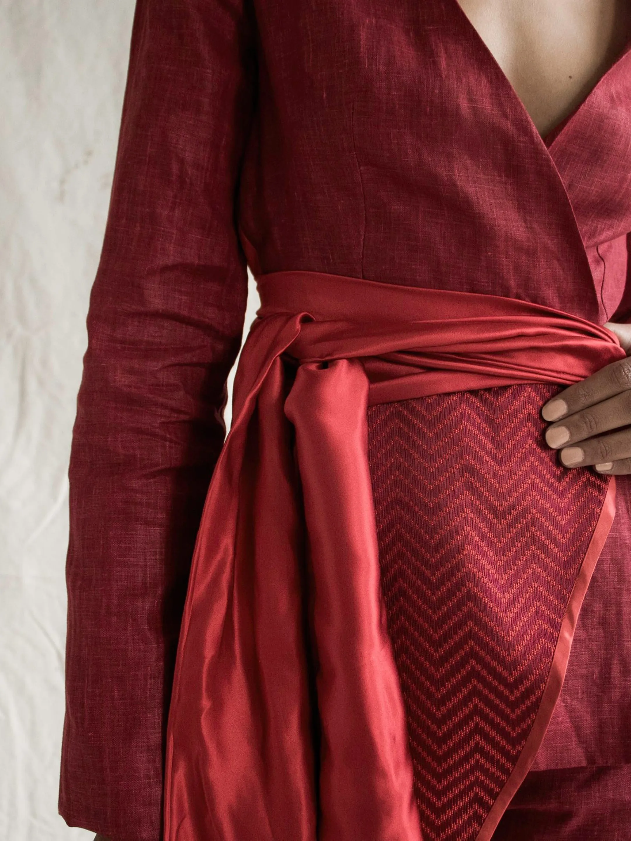
Website for Weruzo, the London womenswear label working to preserve Nigeria’s Akwete weaving tradition. Spare by design, with the clothes and craft carrying the story.